Posted on 3 Comments

Karl Hugo Schmolz: From Architecture to Everyday Life Photography…and Walde Huth

A black and white photograph of a woman standing outdoors, holding a camera and smiling. She is wearing a simple outfit and has short hair, with trees in the background.

As a young man, Karl Hugo Schmolz was introduced to the world of photography, a passion shared by his father Hugo Schmolz, a renowned architectural photographer. By the young age of 15, Karl began accompanying his father on photo shoots.

Under the tutelage of his father, Karl learned the craft and captured stunning shots for prominent architects such as Adolf Abel, Bruno Paul, and Rudolf Schwarz.

When his father passed away, Karl seamlessly continued the family legacy, taking over the Fotowerstatte Hugo Schmolz without any interruption.

However, when World War II broke out, Karl was forced to put aside his photography career and enlist in the German army. Yet, after the war, he documented the cold and devastating aftermath of his country using a large format camera.

One could say that Karl’s most famous work was the combination of his own photos with those taken by his father during the 1920s and 1930s.

His photographic collection includes a wide range of subjects, as Karl was proficient in all kinds of photography, from architecture to design. He even captured everyday life in Germany, while still staying true to his roots as an architectural photographer through the use of clean contrasts and precise framing.

Karl’s talents extended beyond architecture, as he also excelled in interior design and home decor photography.

After marrying fellow photographer Walde Huth, the two combined their last names and created Schmolz + Huth, specializing in fashion photography and portraits.

Karl’s last project was documenting the Museum Ludwig in Cologne, a task he was unfortunately unable to complete due to his untimely passing.

In his works, Karl often used myths as a guide, creating an overall atmosphere that gave life to his own unique reality. In paintings like Eros & Psyche XI and XIII, the deep shades of red and purple support the sensuality evoked by the myth.

on Walde Huth:

Conceived in Stuttgart during the year 1923 and raised in Esslingen, Walde Huth immersed herself in the study of photography from 1940 to 1943 under the tutelage of Professor Walter Hege at the esteemed School of Applied Art in Weimar. Subsequently, she sought employment at the colour photography development department of Agfa/Wolfen, where she spent her days until the conclusion of the Second World War in 1945. Post war, she ventured into the realm of freelance photography, exploring the genres of portrait, theatre, and art.

In 1953, Walde Huth established her own studio in Stuttgart, managing a team of eight skilled individuals. Her stint with Esslinger Wolle furnished her with priceless experience which would pave the way for her unparalleled success with fashion houses such as Christian Dior, Jacques Fath, Givenchy, and Maggy Rouff, immortalizing the iconic “New Look” to global recognition.

The span of the 1950s to 1980s witnessed the birth of a distinctive aesthetic, characteristic of the products of Western Germany. The methodical orchestration, refined techniques, and logical execution were the hallmarks of Walde Huth’s illustrious career.

Following the closure of her studio, which she shared with her late spouse, in 1986, Walde Huth dedicated herself to pursuing freelance projects with renewed vigor. Her masterful works grace the collections of prestigious international museums, immortalizing her legacy. On the eleventh of November, 2011, at the venerable age of 88, the world bid farewell to Walde Huth – a visionary, effortlessly elegant, with a keen eye and wit, a beacon of inspiration and a trailblazer in the realm of German photography.

www.ftn-books.com has the Fotomuseum Den Haag invitation Night awakens now available.

A black and white photograph of a corner building featuring illuminated signs reading 'WORMLAND' and 'WETTLASS,' displaying men's suits in large storefront windows.

Posted on 3 Comments

Exploring Jan van Munster’s Energy Art

A blurred figure in a black outfit gestures toward a tall, conical sculpture or pedestal in a minimalist black and white setting.

Jan van Munster (1939-2024) was a graduate of the Rotterdam Academy of Fine Arts and the Institute for Crafts Education in Amsterdam, later known as the Gerrit Rietveld Academy.

His recurring theme was energy; temperature, magnetism, radioactivity, and electricity served as the point of departure for numerous works that aimed to reveal the invisible. His creations can be found in various locations both nationally and internationally and are included in (inter)national collections.

Jan van Munster was the founder and creator of the concept behind the IK Foundation.

“… He crafts sculptures and spatial installations that manifest contrasts, such as light and darkness, attraction and repulsion, and warmth and cold. On his ice sculptures, the humidity in the room becomes visible through the freezing of water particles in the air onto the cooled, copper parts of the object. The industrial-looking compressors provide the perfect contrast to the layers of sparkling, white ice crystals. As Paul Klee famously stated, ‘Art does not represent the visible, it makes visible.’

www.ftn-books.com is proud to have a large collection of van Munster publications available.

A person standing in a gallery, gazing at a vertical, illuminated line on a white wall, surrounded by a minimalist environment with concrete and smooth flooring.
Posted on 2 Comments

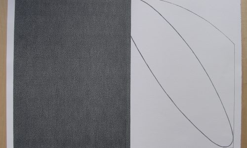
Marthe Wéry: From Classic Techniques to Abstract Innovations

Marthe Wéry attained a mastery of drawing and painting from live models in Paris. She delved into both ancient and modern classics, while also being influenced by the French art of the 1950s. This led her to employ a more schematic style, reducing her compositions to essential lines. Upon returning to Belgium, Wéry was drawn to the expressionist sculptor Oscar Jespers (1887-1970). His home had become a cosmopolitan meeting place, with studios and exhibition spaces. It was here that Wéry was able to break free from the legacy of art history. Her early semi-figurative language evolved into geometrically abstract plane division. Forms were deconstructed, while colors took on a more emotional aspect. Wéry’s work straddles the line between logic and sentiment.

In the mid-1960s, Wéry was admitted into the studio of Sir William Hayter (1901-1988) in Paris. This renowned artist was associated with both surrealists and abstract expressionists, and was best known for his innovative printing and engraving techniques. Wéry later taught printmaking in Brussels and mentored numerous younger artists. Her thorough study of the building blocks of painting – support, paint, color, and line – culminated in geometric compositions heavily influenced by constructivism.

By the late 1960s, Wéry had become familiar with the work of Polish artist Władysław Strzemiński, who had collaborated with Kazimir Malevich. His ideas and Wéry’s were closely related. He posited that every square centimeter within a construction holds the same value, that the surface of a painting is homogeneous, and that the tension of the form must be evenly distributed. He also proposed the use of white space as the standard for presenting art in the most neutral way possible. Under the influence of Strzemiński, Wéry began to focus on the structure of the entire painting surface.

Throughout the 1970s, Wéry focused on refining the relationship between support and representation. By 1975, she had made the transition from canvas to paper. The desire for more ephemeral materials also manifested in other approaches. Through delicate folds, Wéry explored the sculptural potential of paper. The symbiosis between color and texture was achieved when Wéry embedded pigment into the mass of the support. Lines gave way to paper ridges. Support and color merged together. The rigid line definitively gave way to the emotive power of color. Wéry created monochrome canvases, with the dialogue between her artworks and the surrounding architecture becoming increasingly important.

Meanwhile, Wéry achieved international recognition. In 1982, she represented Belgium at the Venice Biennale with 93 canvases of fixed width and variable height. The verticality and luminosity of the red paintings lent a particular depth to the white exhibition space. After thorough research into the color red, Wéry also explored blue, yellow, and green. Her color investigation was showcased in meticulously arranged presentations in a diverse range of spaces, from galleries to abbeys. In the 1990s, Wéry continued to let colors “mature,” as seen in the irregularities caused by pigment crystallization or a grainy paint structure. She also continued to experiment with the physical presentation of her work in dialogue with the exhibition space.

I personally am very fond of her work and after meeting with i must say she was one of the friendliest artists i have ever met .

www.ftn-books.com has some important publications on Marthe Wéry.


Posted on 3 Comments

The Impact of Müller-Brockmann on Modern Design

A man in a suit gestures while holding papers, with abstract art displayed in the background.

Müller-Brockmann is widely regarded as one of the most revered graphic designers in the history of our profession. His creations are studied, taught and published to this day, serving as the pinnacle of Swiss graphic design (also known as the international style). Strongly influenced by the Bauhaus and constructivism movements, typography and geometry dominate his work. Anchored by a rigid grid system that has become his signature style, his compositions exude an economically and rationally precise aesthetic.

Despite his lasting influence in the field, Müller-Brockmann remains somewhat enigmatic. The only complete monograph about him was published by Lars Müller shortly before his passing. The book features an introduction by none other than Paul Rand himself (a testament to his impact!). In it, Lars Müller attempts to uncover what spurred Brockmann’s transition from illustration to a more constructivist approach in his graphic designs.

At the time, Brockmann was greatly inspired by Hungarian photographer Moholy-Nagy’s work and Jan Tschichold’s manifesto, “Die neue Typographie.” This modernist manifesto advocated for the use of bar typefaces (referred to as grotesk in German). These principles greatly influenced Brockmann throughout his career.

These guidelines can be summed up as strict adherence to composition grids, objective imagery to minimize emotional influence, and emphasis on rhythm, harmony, and geometric compositions backed by mathematical precision. One notable example is Brockmann’s approach to concert posters, viewing music as an abstract art and infusing that into his designs. In fact, Lars Müller describes his Beethoven poster from 1955 as the ultimate expression of “musicality in design.”

The principles outlined above can be encapsulated as the utilization of stringent composition grids, objective photographs to convey information devoid of emotions, and the incorporation of rhythm, harmony, and mathematical and geometric arrangements. As an illustration, at the time, Brockmann perceived music as an abstract art form, hence he approached his concert posters through an abstract lens. Critically acclaimed publisher Lars Müller hailed Brockmann’s Beethoven poster (1955) as the epitome of “musicality in design”.

Brockmann articulates his stylistic approach with utmost lucidity: “In my work encompassing posters, advertisements, brochures, and exhibitions, subjectivity is eliminated in favor of a geometric grid that dictates the positioning of words and images. The grid serves as an organizational system that enhances the readability of the message, resulting in a more impactful outcome at a minimal cost. A random organization may seem like an easier, quicker, and more efficient solution, but it fails to achieve the same level of uniformity across international borders (thus, the birth of the international style!), which proves to be advantageous in advertising, as demonstrated by IBM’s success. By communicating information as objectively as possible, the message is conveyed without unnecessary superlatives or emotional subjectivity.”

www.ftn-books.com has the Zurich invitation for his exhibition now available.

Posted on 3 Comments

Remy Jungerman: A Fusion of Modernism and Surinamese Heritage

Black and white portrait of a man with glasses and a beard, wearing a suit jacket and a patterned pocket square, standing against an abstract background.

The work of Surinamese-Dutch artist Remy Jungerman (b. 1959, Moengo, Suriname) is a convergence of diverse forms of cultural expression encountered during his travels and impressions acquired from the different places he has lived in. Upon first glance, his creations seem to adhere to the Modernism style of artists such as Piet Mondrian and Malevich, but simultaneously, it takes inspiration from the rituals of Winti and the distinctive designs of the Maroon peoples of Suriname. This results in a captivating tension between the universal visual language of Modernism and the potent spiritual influence of Voodoo and Winti. From April 11, 2015 to August 16, 2015, Gemeentemuseum Den Haag’s Projects Gallery featured Jungerman’s new pieces specially created for the exhibit, including a series of panels bearing the title Crossing the Water, which marks the first time he has displayed this type of work in the Netherlands.

Hailing from a small Maroon community in Moengo, Suriname, Jungerman pursued mechanical engineering in Paramaribo before eventually attending the renowned Gerrit Rietveld Academy in Amsterdam. However, his oeuvre should not be perceived solely as a representation of a Surinamese artist and his connection with the Netherlands. Jungerman is intrigued by the global voyage of patterns and designs, moving beyond geographic boundaries.

www.ftn-books.com has now the Gemeentemuseum Den Haag invitation available.

A collage featuring a grid of nine abstract compositions with various patterns and colors, including red, black, white, and plaid elements.

Posted on 3 Comments

The Intricate Art of Alex Dordoy: Symbolism and Sentimentality

A man in a blue plaid shirt stands beside a large, horned skull display in a museum, examining it curiously.

Distinguished as both a painter and sculptor, Alex Dordoy delves into the intricacies of artificiality, sentimentality, and the impact of technology on image-making. In his renderings of otherworldly landscapes, Dordoy draws inspiration from the elegant aesthetics of Art Nouveau advertisements and designs, infusing them with symbolic significance. Using Photoshop, the artist expertly manipulates his source images before committing them to canvas, imbuing them with a tangible presence. By altering and rearranging the original compositions, their previous connotations are stripped away and replaced with vivid, frozen moments captured before our very eyes. The essence of romanticism and nostalgia still linger, set against the artist’s meticulous and graphic brushstrokes.

Bright, vibrant tones are often used in Dordoy’s multiple versions of the same image, evoking a sense of time passing under the influence of an artificial light source. While signs of civilization are prominent in many of his pieces, the figure itself is noticeably absent. This lack of a protagonist or sympathetic figure implicates the viewer as an active participant in the narrative. With this adaptation, enigmatic complexity and linguistic dynamism converge to create a wholly original conception. Keep these concepts in mind as you embark on your own journey of rewriting, reframing, and revitalizing written content.

www.ftn-books.com has the Gemeentemuseum invitation for his exhibition now available.

An abstract composition featuring a blend of vibrant colors and geometric patterns, evoking a sense of artificiality and nostalgia. Elements suggestive of urban landscapes and technology are interspersed with a soft gradient, creating an otherworldly atmosphere.
Posted on 2 Comments

The Art of Paul Kooiker: Transforming Photography into Visual Narratives

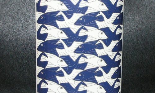
I was preparing a little text on the invitation i have available on the Paul Kooiker exhibition at the Fotomuseum Den Haag and noticed the similarities between the classic Jessurun de Mesquita print and the photograph of Kooiker.

For Paul Kooiker (1964), the pursuit does not lie in creating the perfect photograph. The value lies not in his individual images, which may at times be overexposed, blurred, or grainy, but in what he does with them afterwards – the selecting and editing process. In the initial phase of his workflow, he intentionally takes on the role of a “bad” photographer, only to then transform into a visual artist, working with the exploratory material often consisting of hundreds of photos. Based on this, he then assembles a collection through spatial installations and photobooks that appears either found or entirely retrieved from an old suitcase that has been sitting in an attic for decades. The apparentness of such a “found collection,” which Kooiker manages to make persuasive through his precise attention to a consistent form and style, contrasts starkly with the content of his series, which can often be described as enigmatic and somewhat unsettling.

Paul Kooiker studied at the School of Photography in The Hague and the Rijksakademie van beeldende kunsten in Amsterdam. In 1996, he won the Prix de Rome, and in 2009, he received the A. Roland Holst Prize for his body of work. Alongside numerous exhibitions both nationally and internationally, Kooiker also dedicates a great deal of attention to publishing his photography. In the final room of the Photography Museum, he displays a multitude of his art books that have been published since 1999, often in collaboration with publisher Willem van Zoetendaal.

May of these are available at www.ftn-books.com

Posted on 3 Comments

Damien Hirst ” MEMENTO MORI”

A man with glasses and a leather jacket standing confidently in front of a colorful butterfly art installation.

he artwork known as “For the Love of God,” created by artist Damien Hirst in 2007, is a sculpture that is both enigmatic and linguistically dynamic. It comprises of a platinum cast of an 18th-century human skull, adorned with 8,601 flawless diamonds, including a pear-shaped pink diamond on the forehead, which is referred to as the Skull Star Diamond. The skull retains its original teeth, purchased in London by Hirst himself. It serves as a memento mori, a reminder of the viewer’s mortality.

Art historian Rudi Fuchs described the piece as “otherworldly, almost celestial. It proclaims triumph over decay while representing death as an even more relentless force. In contrast to the sorrowful mood of a vanitas scene, the diamond skull embodies glory.” The production costs for this work totaled £12 million, and it debuted at its first exhibition, “Beyond Belief,” at London’s White Cube gallery, with an asking price of £50 million. This would have made it the most expensive artwork by a living artist. As of January 2022, Hirst has stated that he is still a co-owner of the sculpture, which is currently stored in London.

The foundation of the piece is a human skull acquired in a shop in Islington. It is believed to be the skull of a European individual who lived between 1720 and 1810.[3] Hirst’s mother is said to have inspired the title of the artwork with her question, “For the love of God, what will you do next?”

Designed and sculpted by Jack du Rose and manufactured by Piccadilly jewelers Bentley & Skinner, 8,601 impeccable diamonds, weighing a total of 1,106.18 carats (221.236 g), are meticulously set into a platinum cast of the skull. The centerpiece of the piece is a pear-shaped pink diamond resting on the forehead. All diamonds used in this artwork are ethically sourced.

www.ftn-books.com has now the invitation for his Gemeentemuseum Den Haag exhibition available.

A diamond-encrusted skull sculpture by Damien Hirst, adorned with 8,601 diamonds including a prominent pear-shaped pink diamond at the forehead, against a black background.

Posted on 2 Comments

Bernard Aubertin

Aubertin performing with fire, igniting a textured art piece during a live demonstration.

Bernard Aubertin (1934-2015), born in Fontenay-aux-Roses and a renowned Zero artist, received his education in a Parisian suburb. As an autodidact, he initially experimented with painting in the style of Futurism and Cubism. However, in 1961, Aubertin left Paris and joined Heinz Mack, Otto Piene, and Günther Uecker, the founders of the New Zero Movement in Düsseldorf. He also had a close friendship with Piero Manzoni, a prominent Italian member of the movement. He passed away in Reutlingen, Germany.

Aubertin gained recognition for his monochromatic red works, as well as his red nail pieces (“Tableaux-clou”), iron wire works (“Tableaux Fil de Fer”), and fire performances. His monochromatic work, “Rouge total,” marked a significant shift in his artistic career, inspired by Yves Klein’s monochromatic blue works, whom he visited in 1957. Shortly after, he joined Zero.

Together with other Zero members, Aubertin rebelled against the pictorial traditions of the time, represented by Art Informel and Neo Expressionism. Monochromatic works were used by many Zero artists as a way to break free from the conventions of painting and aesthetics, aiming for a “tabula rasa” or creating a “pictorial silence.” These works neutralize figuration, lines, and forms, yet still evoke emotion and experience. They describe nothing and express nothing, but rather represent a kind of essence.

Moreover, like the element of fire, which was the most important component of his performances, he would burn objects such as violins, books, pianos, cars, and paintings, or organize patterns of match sequences (‘Parcours d’Allumettes’) and fire paintings (‘Tableaux-feu’) on a surface starting from the 1960s.

Fire and red symbolize renewal, energy, dynamism, destruction, rebirth, and many other rich interpretations in psychology. Based on his experiences working with fire, he also produced a lot of work in which red was combined with black as an inseparable duo. In recent years, white and gold have also been employed in Aubertin’s work.

Along with other members of the Zero group, he exhibited in group shows in Frankfurt, Amsterdam, Rotterdam, Berlin, and Milan, as well as in the United States and, for example, the Documenta in Kassel starting from the 1960s. Aubertin’s works can be found worldwide in prominent institutions and collections such as the Solomon R. Guggenheim Museum (New York), the Stedelijk Museum (Amsterdam), the Palais de Tokyo (Paris), the Graz Museum, the Kunstpalast Düsseldorf, Centre Georges Pompidou (Paris), and the Centre National de l’Art Contemporain (Paris).

www.ftn-books.com has several Aubertin publications available.

Posted on 2 Comments

Discover The Hague’s Fashion Icon: Frans Hoogendoorn

A distinguished couturier seated in a studio surrounded by mannequins displaying elegant fashion designs, including a sophisticated hat with a large flower.

For over four decades, the renowned Couturier Frans Hoogendoorn has been a revered figure in the Netherlands. His legacy is inextricably intertwined with The Hague, a city synonymous with court life, nobility, and international diplomacy – and of course, the world of high fashion. From the 1970s onward, he has earned widespread acclaim for his effortlessly chic designs, heavily influenced by the sophistication of Parisian couture. His timeless creations, with a discernible global flair, are coveted by the leading women of Dutch society, including members of the royal family. The exhibition at the Gemeentemuseum is a fitting tribute to this Haagse couturier, featuring a stunning display of his collection drawings, film footage, and top-notch examples of his work.

Throughout his illustrious career, Frans Hoogendoorn has purposely shunned the spotlight and instead devoted himself wholeheartedly to catering to the needs of his clientele and perfecting his craft. As a result, he has earned great admiration for his meticulous, fervent, and client-centric approach. In 1974, he established his business in The Hague, quickly amassing a loyal following within the city’s elite. His Molenstraat salon, until its closure in 2014, was a beloved and fashionable landmark in the heart of the bustling metropolis.

www.ftn-books.com has the inviatation for the Hoogendoorn exhibition now available.

A fashion illustration featuring a model with an elaborate pink hat and a matching pink shawl. The background includes vintage newspaper clippings, enhancing the artistic presentation. The signature 'FRANS HOOGENDOORN' is visible at the bottom.