Desiree de Baar, a native of Rotterdam, pursued a degree in Autonomous Visual Arts at the Willem de Kooning Academy. Her expertise lies in creating site-specific textile works, ranging from three-dimensional objects made of wool, fabric, paper, and knitting. Often, her pieces showcase a detailed depiction of technique, patterns, and diagrams. With her art taking center stage in the architectural world, she offers a unique experience of space. Her works have been featured in numerous exhibitions and are part of various private and corporate collections. From 2008 to 2012, she served as curator of the Bewaerschole, an experimental and contemporary art exhibition space in Burgh-Haamstede. Additionally, De Baar has been teaching and mentoring students at the Willem de Kooning Academy since 2008.
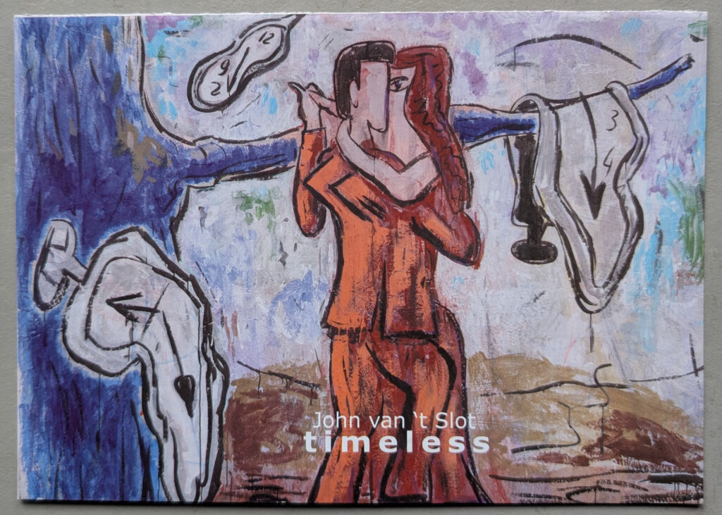
John van ‘t Slot emerged as an artist in the late 1970s, showcasing large, figurative paintings. In doing so, he aligns with an international trend where narrative and expressive painting (once again) gains popularity. For Van ‘t Slot, the focus lies primarily on the thematic and artistic freedom that accompanies this renewed attention for painting. His work is eclectic, not only in theme but also in form and use of color. A recurring motif in his work is the horse, serving as both a carrier of humans and a symbol of meaning. Thus, the representation of horses in Van ‘t Slot’s work reflects various painting styles of the 20th century. This emphasizes that for a contemporary artist, it is impossible to fully detach oneself from the legacy of modernism. The horse becomes the personification of (the history of) painting.
The painting ‘Untitled’ does not feature a horse, but instead a fantasy creature resembling a seahorse. The human figure with antlers standing next to it is in a precarious position: surrounded by fire and sprayed by two spitting clouds. The white shapes near their mouths suggest that this does not prevent them from having a conversation. The use of color in this painting is striking: the figures, together with the background, form a compositional interplay of colors.
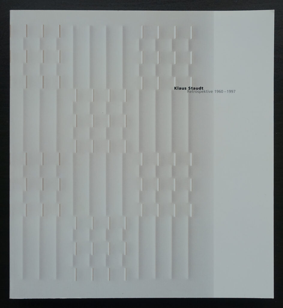
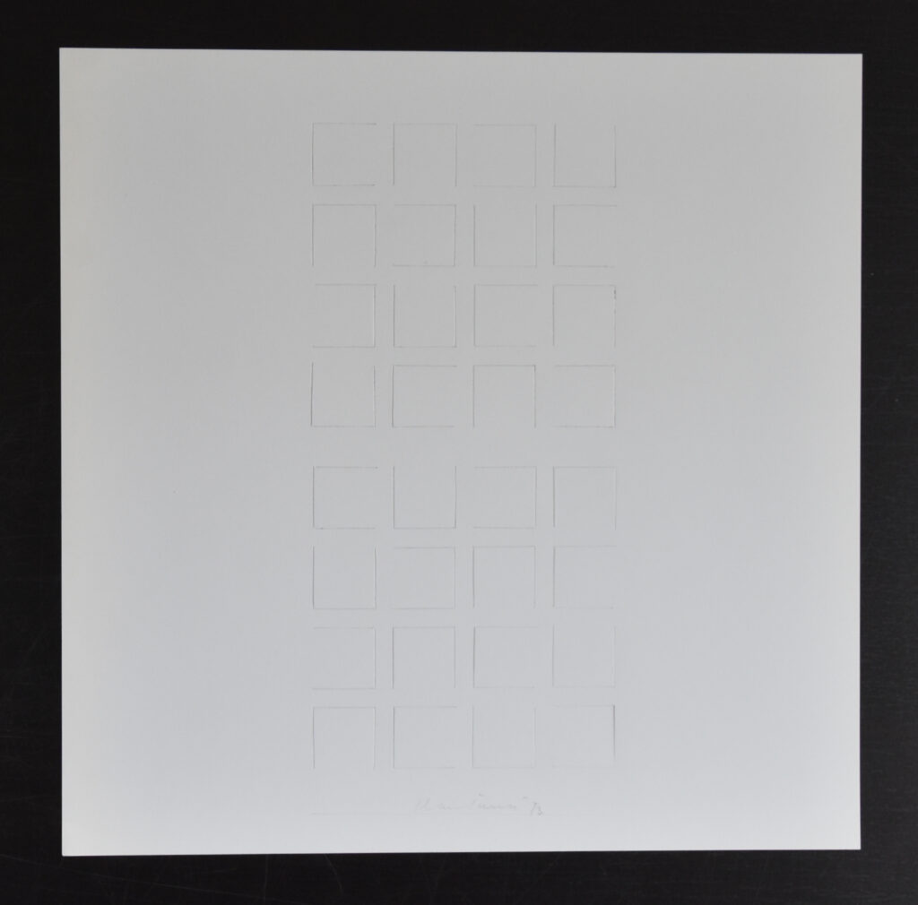
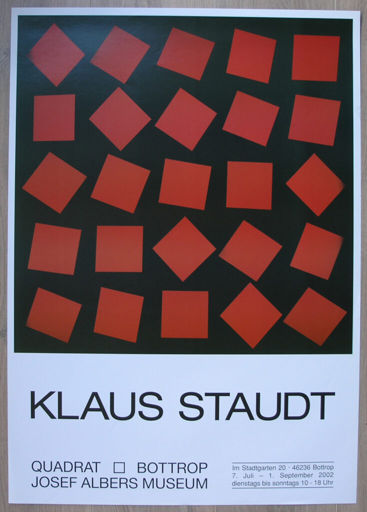
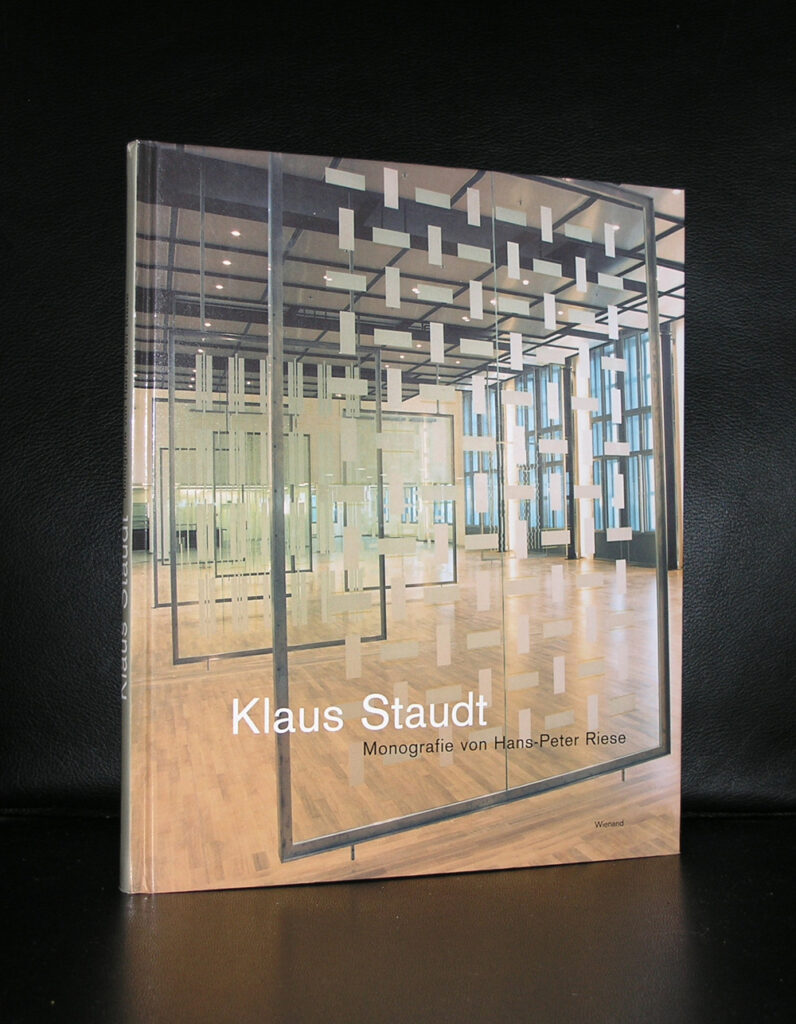
Klaus Staudt (born 1932 in Otterndorf am Main, Germany) stands among the foremost advocates of constructive and concrete art in his home country. While pursuing his medical studies from 1954 to 1959, a visit to the Academy of Fine Arts in Munich ignited a passion for art, leading him to enroll in a course under the tutelage of Ernst Geitlinger and Georg Meistermann. In 1960, along with Gerhard von Graevenitz and Jürgen Morschel, Staudt established the celebrated nota gallery in Munich, establishing himself as a member of the nouvelle tendance.
His body of work is rooted in simplistic geometric forms, enclosed in transparent Plexiglas, creating an optical illusion of movement as the beholder’s gaze roams. The interplay of color, light, and shadow imbues the perception of the observer. With a consistent presence in galleries for over four decades, Staudt received a retrospective at the Museum für Konkrete Kunst, Ingolstadt in 1997. His pieces are displayed in numerous prominent public and private collections throughout Europe, including the Daimler AG Collection in Stuttgart, the Museum of Concrete Art in Ingolstadt, and the Haus Konstruktiv in Zürich, as well as the Kunstmuseum Basel.
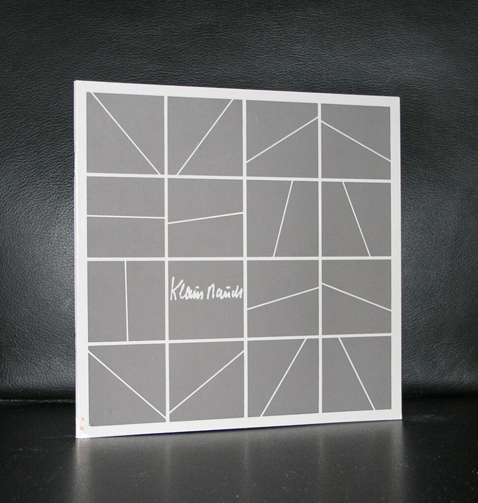
www.ftn-books.com com has a nice choice of Staudt related items available.
Since 2003, Henri Jacobs (1957) has been working on an ever-expanding series of drawings. These are known as Journal Drawings, which originated from an assignment given by Henri Jacobs to his students: draw what catches your eye or occupies your mind to free yourself from the pressure of coming up with a subject. He then applied this method to his own work, resulting in a continuously growing series of drawings where forms and motifs are developed, and then let go to make room for new investigations and experiments in drawing.
Henri Jacobs’ drawings are characterized by great technical ability, being both highly accurate and virtuosic, while also playful and inventive. The images he creates range from abstract geometric and calligraphic shapes and patterns to stylized portraits, landscapes, and architectural spaces. He often references art history and the work of other artists, such as Matisse and Jasper Johns. The Journal Drawings are a continuous creative process in which Henri Jacobs continually redefines himself and explores the possibilities of drawing.
Moreover, Henri Jacobs employs a unique skillset in his work, demonstrating his proficiency through precise and masterful drawings, while also adding a touch of playfulness and ingenuity. The visual representations he creates span a wide range, from abstract elements to realistic portraits, landscapes, and architectural formations. He frequently draws inspiration from art history and the works of other artists, including the likes of Matisse and Jasper Johns. The Journal Drawings serve as an ongoing process of creation, allowing Henri Jacobs to constantly redefine himself and explore the limitless potential of drawing.
The work of David Batchelor revolves around one primary obsession – color. His adoration for the myriad vibrant shades of the urban environment is accentuated by a critical awareness of how we perceive and respond to color in our highly advanced technological age.
Within his studio lies a veritable treasure trove of fluorescent plastic objects, procured from pound shops and markets across the globe – clothes pegs, fly-swatters, buckets, spades, children’s toys, and empty bottles of household products – all stacked high. Batchelor expertly combines these everyday items with a variety of light-industrial materials – steel shelving, commercial lightboxes, neon tubing, warehouse dollies, acrylics, plastics, and more – to produce extraordinary installations that elevate the mundane and celebrate the gaudy and garish, mesmerizing viewers with their innate beauty.
Born in 1955 in Dundee and currently residing and working in London, Batchelor has garnered recognition through various exhibitions. In 2013, his two-dimensional work, Flatlands, was on display at the Fruitmarket Gallery in Edinburgh before touring to Spike Island in Bristol. The Whitechapel Gallery in London also featured Batchelor’s work in the renowned group exhibition Adventures of the Black Square: Abstract Art and Society 1915 – 2015. Additionally, a separate exhibition showcasing Batchelor’s Monochrome Archive (1997-2015) was on view at the Whitechapel Gallery until May of 2015. More recently, during the 2019 Edinburgh Art Festival, Ingleby presented My Own Private Bauhaus – a solo exhibition showcasing Batchelor’s sculptures and paintings.
Batchelor’s extensive portfolio includes numerous noteworthy temporary and permanent public artworks, including a commission for the British Council headquarters in Hong Kong, Spectrum on the Hill in Seoul, South Korea, a 10-meter high light installation at the Archway Tube Station in London, and a captivating chromatic clock titled Sixty Minute Spectrum adorning the roof of the Hayward Gallery.
www.ftn-books.com has the GEM invitation for his exhibition now available.
Antoine d’Agata, born on November 19, 1961 in Marseille, France, diverged from his studies at the age of 17 to immerse himself in the world of the night. For 12 years, he traversed more than 20 countries, capturing moments through his lens. In 1991, with no prior photographic background, he took the leap to enroll at the International Center of Photography in New York, learning from the likes of Nan Goldin and Larry Clark. After a brief hiatus, he returned to France in 1993 and put his photographic practice on hold, working as a bricklayer.
His first book, Mala Noche, was published in 1998, followed by receiving the prestigious Niépce Prize in 2001. Reflecting his extensive travels, his series 1001 Nuits was exhibited in Paris in 2003 and accompanied by the release of two books, Vortex and Insomnia. In 2004, D’Agata joined the renowned Magnum Photos agency, which also marked the publication of his fifth book, Stigma, and his directorial debut with the short film El Cielo del muerto. The following year, he went on to shoot his second film, Aka Ana, in Tokyo. More recently, his four-hour film White Noise (2019) featured the voices of 24 women. In 2013, he was honored with the Photographic Book Prize at the Rencontres d’Arles for Anticorps, a collection of his work that coincided with a major exhibition at Le Bal in Paris.
Antoine d’Agata’s artistry delves into the realm of contemporary violence, exploring two main themes: the violence stemming from economic and political factors (migration, refugees, poverty, war) and the violence faced by marginalized social groups due to poverty (survival through crime, drug addiction, excessive sexuality). His latest projects include VIRUS (2020), documenting the Covid-19 pandemic, and Antoine d’Agata – Francis Bacon (2020), a fusion of his works with those of the renowned artist.
With a photographing career spanning over 30 years and 50 published works, Antoine d’Agata’s compelling artistry has garnered international recognition. His solo exhibitions have graced numerous museums, and his works have also been included in public collections. As a full member of Magnum Photos since 2008, D’Agata’s work continues to captivate audiences worldwide.
Capturing the brightest light with the deepest charcoal black, Carlijn Mens weaves a tapestry of enigmatic complexity. Shadows dance and sway, transforming trunks, branches, and leaves into ever-shifting silhouettes. In time and space, she follows, casting a web of black on white and light out of darkness, tracing the shadows that nature and life outline on earth, branches, leaves, plants, floors, walls, and sheets of paper. Her own body is intricately involved in this performance of shadow and light. It often appears in the images – an instrument of observation, a reality that leaves behind traces and brings other bodies into presence. Body, charcoal, and paper together create an endless field to be traversed.
I once watched Carlijn drawing in her studio. I saw her lines being drawn and smudged, contours being formed, blacks and greys being applied and then erased, replaced by other greys and new whites. What struck me: with one movement, she accomplishes five things simultaneously. Every action, every second is multifaceted.
www.ftn-books.com has the GEM invitation for her exhibition available.
Michael Parkes is the world’s leading magical realist painter, sculptor, and stone lithographer. His decades of success as a fine artist stand out in the art world where few artists ever achieve success in both the primary and secondary markets. Michael Parkes’ works are collected by celebrities, prominent private collectors, and galleries around the world, and his body of work stands for all ages. His first one-man show was in Amsterdam back in 1977. Additional one-man exhibitions of Michael Parkes have taken place at Basel Art in Switzerland, Art Chicago, Art Fair NY, Frankfurt Bookfair, Amsterdam Art Fair, Tefaf Art and Antiques Fair Maastricht and numerous exhibitions in their galleries in Amsterdam and New York from 1977 onwards.
Though he studied graphic art and painting at the University of Kansas, his unique style evolved very much in isolation, after a period in which he gave up the practice of art altogether and went off to India in search of philosophical illumination: born in 1944, Michael Parkes was very much of the hippie generation.
Earlier on, Michael Parkes had painted in the generally Abstract Expressionist style normal among his teachers, but after his pause for reflection he began to draw and paint in a meticulous style of detailed representation which would enable him to give full expression to his inner world of images.
WWW.FTN-BOOKS.COM HAS A VERY NICE COLLECTION OF PARKES PUBLICATIONS AVAILABLE
The French artist Gustave Caillebotte (1848-1894) was the enigmatic force behind the impressionists. His avant-garde work is innovative, daring, and free from compromise due to his affluent background, allowing him to not rely on the sale of his art for a living.
In addition, as a patron, he played a significant role in the success of impressionism. He financially supported friends such as Claude Monet and Auguste Renoir by purchasing their work and organizing exhibitions. Caillebotte has now earned a well-deserved place in art history, not just as a patron but also as an artist, in countries such as France, England, and the United States. The Gemeentemuseum Den Haag exhibited the first comprehensive overview of this grand artist in the Netherlands in the spring of 2013, focusing on the interplay between his painting and the emerging field of photography. The invitation for the exhibit is now available for acquisition at www.ftn-books.com
Driven by an insatiable curiosity, Joost Zwagerman has been writing about visual art for decades with a passionate pen. To mark his 50th birthday and the release of a new publication by this self-proclaimed “incurable art lover”, the Gemeentemuseum Den Haag presents a unique exhibition that brings together his love for words and images. In The Space Trembles a Stroke of the Pen, an intriguing dialogue arises between Zwagerman’s poetry and the works of his artist friends, Pieter Bijwaard and Harald Vlugt.
Searching, experimenting, probing, combining, and cutting. Through a close friendship, the artists respond to Joost Zwagerman’s poetry and vice versa. Pieter Bijwaard describes their extraordinary collaboration: “An artist working with a poet is conspicuously unassuming, outspoken without desiring the last word.” Especially for this exhibition, Vlugt created two new collage works in response to Zwagerman’s poems about looking at art. In the showcases, amidst the artworks and poems, the books that Zwagerman has made in collaboration with the two artists over the years are on display.
The result an exhibition at the Gemeentemuseum Den Haag to celebrate his 50th birthday . The invitation is a classic.
Artist/ Author: Oliver Boberg
Title : Memorial
Publisher: Oliver Boberg
Measurements: Frame measures 51 x 42 cm. original C print is 35 x 25 cm.
Condition: mint
signed by Oliver Boberg in pen and numbered 14/20 from an edition of 20