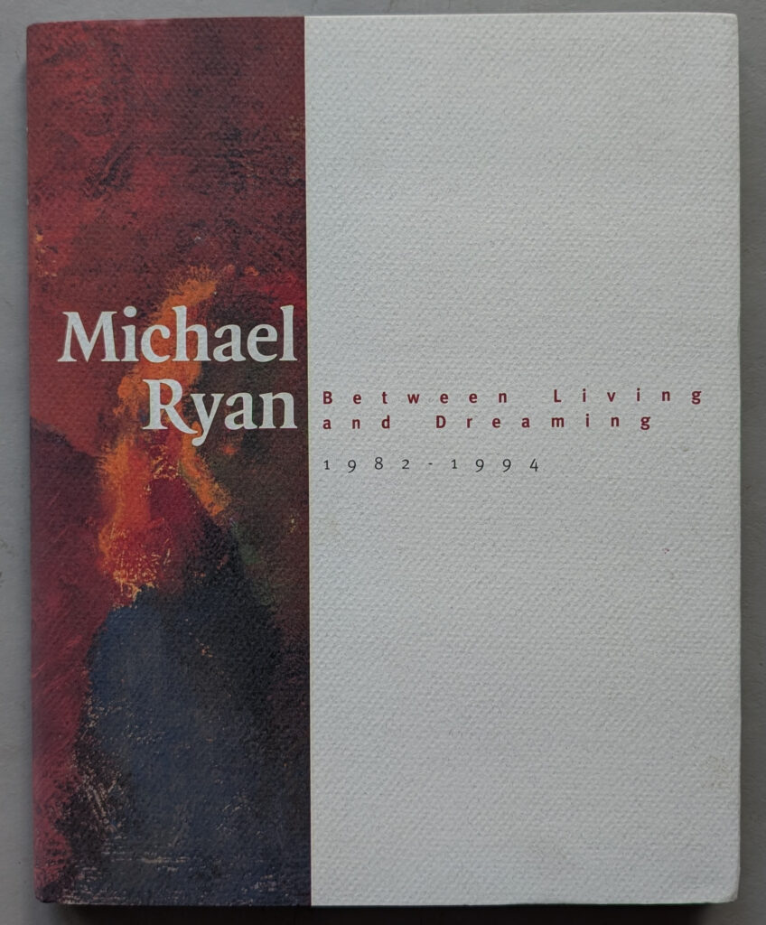
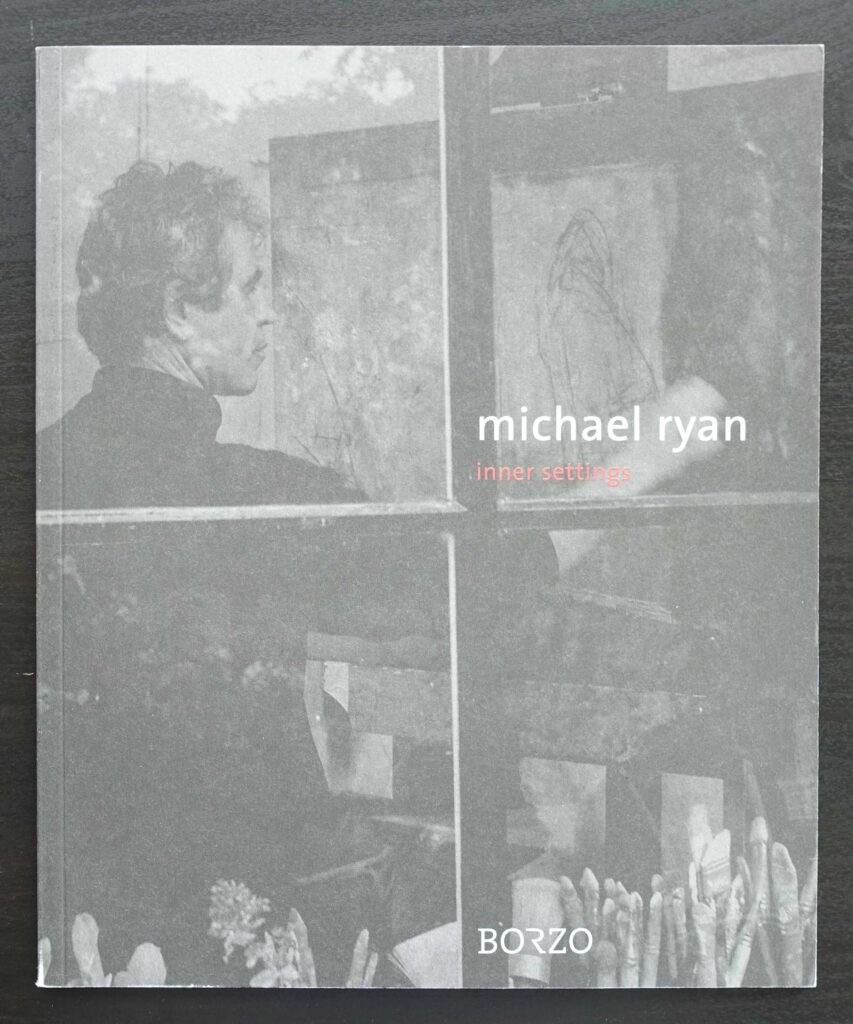
Michael Ryan pursued a degree in Fine Art and Illustration at Columbia College of Chicago before settling in Brooklyn, New York where he currently creates and showcases his work.
Ryan’s creations are a fusion of mixed media on paper, drawing inspiration from early 20th century found photographs encompassing diverse subject matters. He employs the source image as a starting point, imbuing it with his complex process of augmentations and modifications, culminating in a work of intricacy, enigma, and allure.
The illustrious Anna Marra Contemporanea in Rome represents Michael Ryan. He has garnered acclaim with solo exhibitions hosted by Anna Marra Contemporanea, Wanwan Lei Projects in New York, Cathouse Proper in Brooklyn, NY, as well as a solo booth at Drawing Now Paris through collaboration with Anna Marra Contemporanea. Ryan has also been a part of group shows at esteemed galleries such as Van Doren Waxter in New York, Phoebus Gallery in Rotterdam, and Project Plus in London.
In 2013/14, Michael Ryan received a prestigious fellowship and residency at the Marie Walsh Sharpe Foundation in Brooklyn, New York, further solidifying his reputation as a renowned artist.
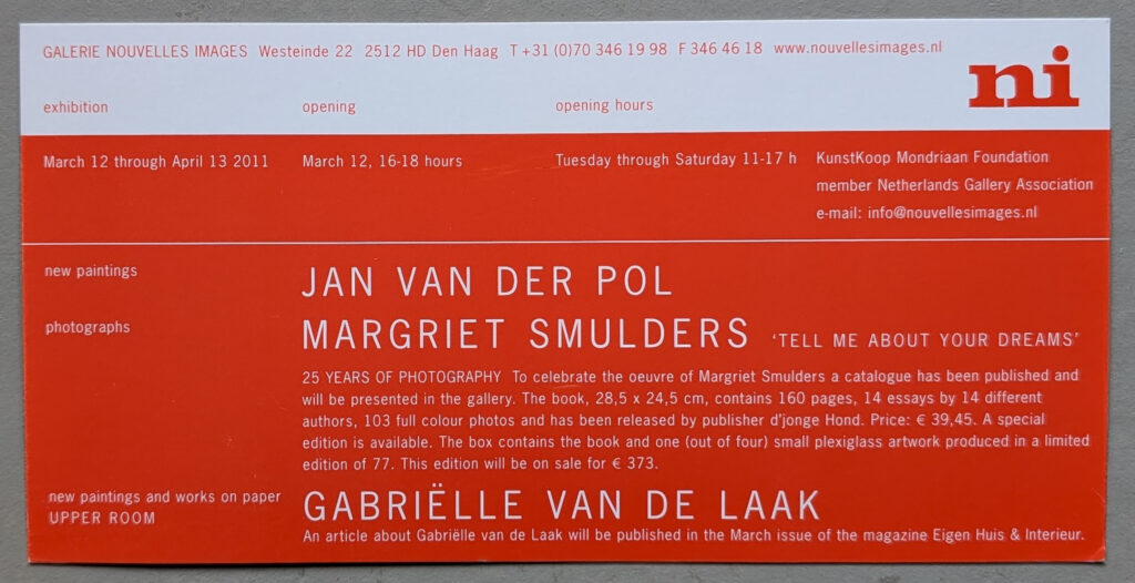
Jan van der Pol epitomizes versatility as an artist. His repertoire includes paintings, drawings, lithographs, woodcuts, and etchings. Notable in his early work from the early 1980s is the focus on the upper portion of the canvas, led by high horizons and standing figures in the landscape, inspired by the photographs of E.J. Muybridge (English photographer, 1830-1904). After exploring cityscapes, particularly in 1984, the portrait motif emerged in his work, initially as busts but later also as full-fledged faces. Van der Pol’s art does not conform to any specific movement or framework, making it somewhat enigmatic to some. He combines images from his direct observation as well as from television or photographs, creating a unique fusion of visuals in each of his works. One can observe his fondness for structured horizontal and vertical lines (compartments, grids, boxes) in almost every piece, wherein various motifs such as landscapes, human figures, and portraits come to life. Alongside the prevalent use of black, grey, and white, color also holds a prominent position in his art. Complementary and aesthetically pleasing colors are juxtaposed intentionally. Van der Pol’s masterful play with colors transforms those that clash and appear unattractive into beautiful blends.
Jan van der Pol’s work is a cherished possession of several museums, municipalities, and art rental companies. He has been recognized with accolades such as the Van Bommel- Van Dam, Arti Medaille, and Basisstipendium Fonds. His art has been showcased in both solo and group exhibitions.
Rolf Engelen (b. 1964), from Nijmegen, underwent his education at the Academy of Fine Arts and Design in Den Bosch. A versatile visual artist, Engelen boasts not only a prolific exhibition record but also a plethora of community projects in public spaces under his belt. From 1995 to 2006, he served as the director of the Biannual Exhibition at Nagsael Museum, and in 1997, he founded the Second Chance Plant Company, dedicated to rescuing street plants. Currently residing and working in Rotterdam, Engelen is also a faculty member at the Willem de Kooning Academy.
www.ftn-books.com has the RAM invitation for his exhibition now available.
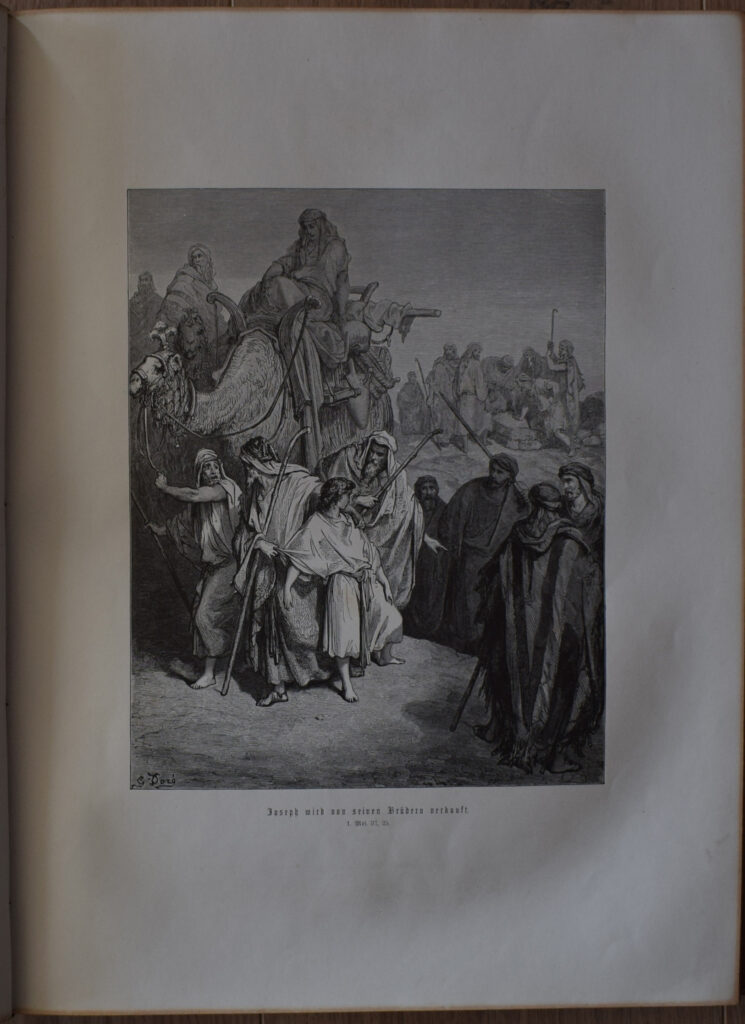
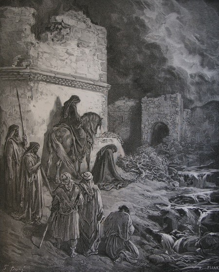
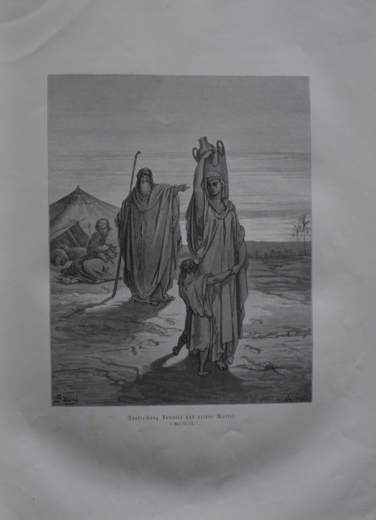
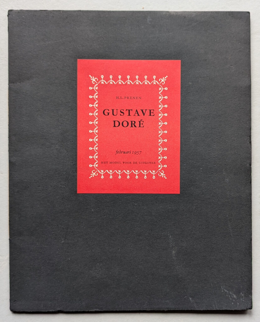
Paul Gustave Doré was born on January 6, 1832, in Strasbourg, France. He is considered one of the most important and prolific, as well as successful, book illustrators and mediators of late 19th-century European culture.
He was largely self-taught and even as a child, he showed his inclinations towards painting and drawing. In 1845, Doré arrived in Paris. In 1848, he became a contributor to the “Journal pour rire”.
With his rich and bizarre imagination, Gustave Doré created dreamlike scenes and illustrated works from world literature such as Dante’s “Inferno”, Cervantes’ “Don Quixote”, John Milton’s “Paradise Lost”, Edgar Allan Poe’s “The Raven”, works by Homer, Lord Byron, Johann Wolfgang von Goethe, and many others. The illustrations for Dante Alighieri’s “Divine Comedy” in 1868 were the crowning achievement of Doré’s career.
His diverse body of work includes various genres, from comics to Bible illustrations. Doré even had an impact on Hollywood film production. Some images in famous films such as King Kong, some creatures from the Star Wars universe, and the Dead Tree in Sleepy Hollow bear resemblance to Doré’s illustrations. He was also a painter, draftsman, etcher, and later even a sculptor.
The artist possessed a distinctive ductus, employing the clair-obscur technique to contrast light and dark paintings. His pieces exuded depth and mystique, often featuring intricate details and realistic depictions of fantastical creatures and showmen. Minimalistic yet dramatic, his drawings evoked intense emotion and created powerful imagery. The works that shaped him were grotesque, macabre, and filled with fantasy and exaggeration. Gustave Doré’s illustrations documented the Crimean War, the Commune of Paris, and the proletariat of London, while his watercolor landscapes were also highly acclaimed. Two of Doré’s most successful oil paintings were “Paolo and Francesca da Rimini” (1863) and “The Neophyte” (1868). His illustrations of the English Bible (1866) and fairy tales by Charles Perrault were also widely renowned.
In 1867, Doré held a major exhibition of his work in London, leading to the establishment of the Doré Gallery on New Bond Street.
However, not all of Doré’s engravings were crafted by his own hand. With a team of 40 employees, he was able to meet the high demand for his illustrations and drawings. His original works were sold in galleries in Vienna, London, and other cities, as well as reproductions of his book illustrations, bringing great financial success and a carefree life for the artist.
Five years before his death in 1877, Doré turned to sculpting. Without any formal training, he produced ingenious marble and bronze sculptures that left their mark on the art scene of the 1870s. His final work was a monument for Alexandre Dumas, a testament to his passion and talent as a sculptor.
Dore never married, instead remaining in the comforting bosom of his mother in the bustling city of Paris. His work ethic was unmatched, fervently producing an abundance of drawings despite the nagging feeling of inadequacy and perennially feeling misunderstood. The true extent of his prolific output of drawings remains a mystery, for he toiled tirelessly from sun-up to sundown, creating thousands of masterpieces.
Sadly, on 23rd of January, 1883, the world lost the remarkable Gustave Doré to a sudden heart attack.
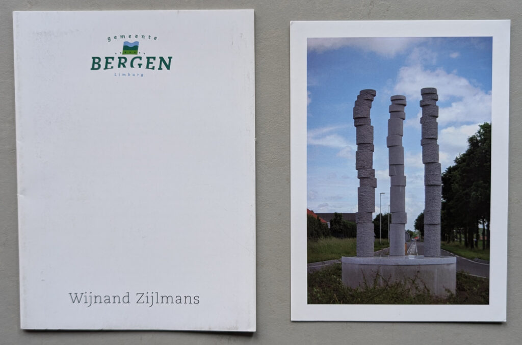
Wijnand Zijlmans possesses an unrelenting passion for natural stone, a material that harkens back to the distant past and has traversed a long journey before being breathed new dimensions by the sculpteur. With a mastery that is both transparent and meditative, Zijlmans reveals the massiveness and poetry of the stone, delving deep into its natural essence. He exposes both its internal and external facets, revealing its ever-shifting nature – at once hard and soft, dark and light, rough and gracefully polished, frayed and undulating, in a constant state of motion yet serene in its stillness. The stone’s surface reflects and absorbs, taking in and releasing, much like a poet who captures the essence of an entire life in just a few words. The sculptures are a tangible presence, open for those who allow themselves to be enchanted. They are anchors of tranquility in a hectic world, providing stillness and repose for those seeking solace. They invite contemplation and introspection, bestowing upon viewers a deeper understanding of themselves. There is an exchange between the artwork and the observer, something stirring within and between, a connection that Wijnand Zijlmans holds in high regard. To him, life is a towering edifice, a tumultuous and intricate structure constantly in search of balance.
His work is heavily influenced by the cultures of India and China. Through multiple Artist in Residence programs, he has visited these countries numerous times to continually experience the immense cultural and historical richness they possess. As he puts it, this has been a source of enrichment, which he then utilizes to create new works.
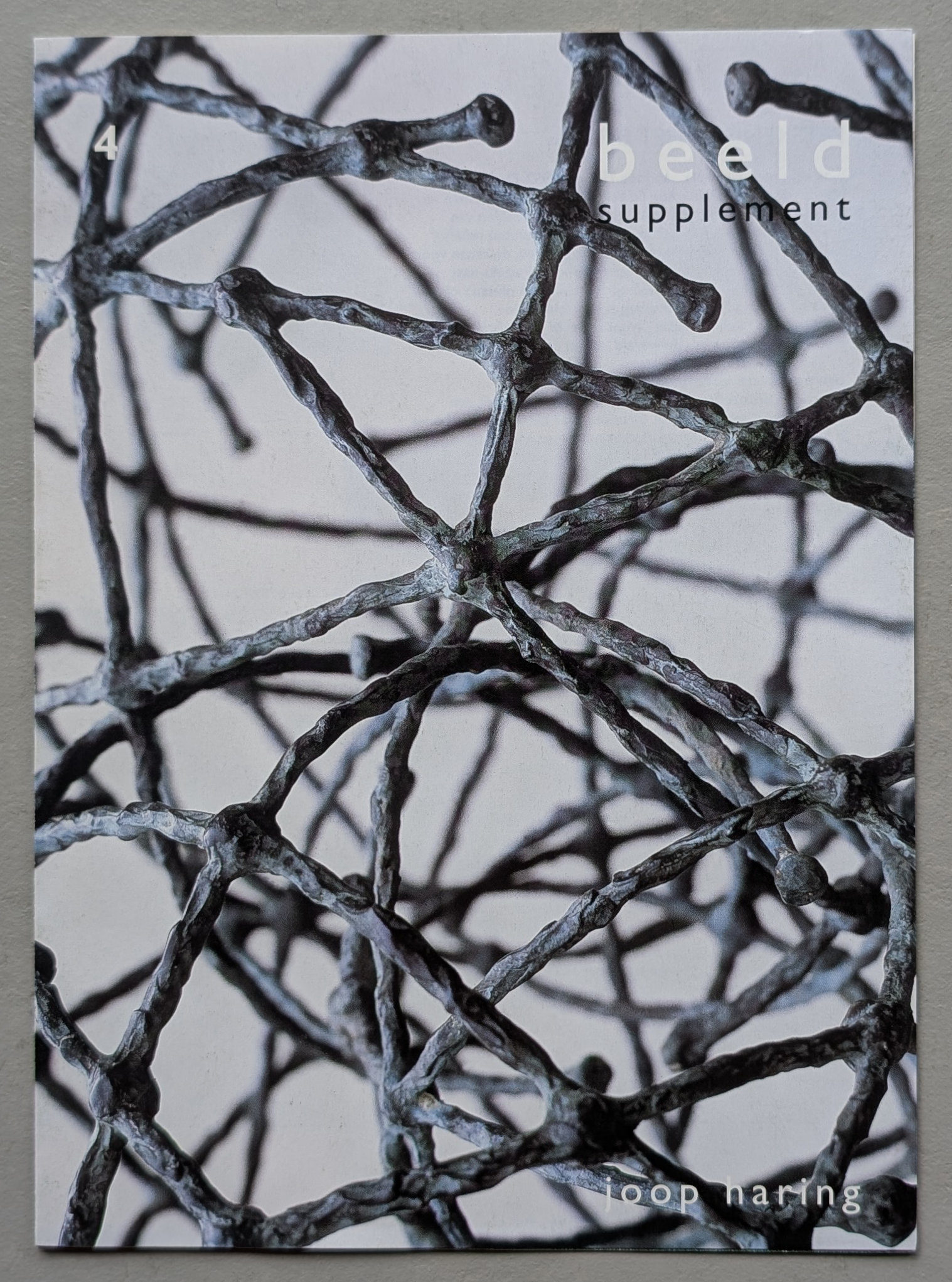
Haring (’52) returned to India in December 2023 for another project, building on the success of his previous endeavor, “The Golden Light,” Amsterdam – Varanasi (presented at WG Kunst 2021, exploring holy Hindu places).
During this project, he sought a connection between “Religion and Light” (hard-cover book in English and Dutch). In Haring’s viewpoint, there is a sense of “magic” when extraordinary natural phenomena serve as a catalyst for people to create new spiritual spaces. Thus, ritual sites are born.
Among indigenous groups in Tamil Nadu, there is a strong sense of connection to nature, giving rise to new expressions of these rituals.
In his latest project, “Light/Shadow, an Inspiration,” this fascination with the magical moment of experience is translated into new drawings, sculptures, wall objects, and photographs. It is a “total experience” and how these works relate to each other in the exhibition.
Born in the from the small town of Kupiškis in 1969, this artist now resides and works in the bustling city of Vilnius. With a bachelor’s degree from the prestigious Vilnius Academy of Arts, specializing in Graphic Art, and a master’s degree from the Department of Painting, she has been a member of the Lithuanian Artists’ Association since 1999. Her impressive display of talent has garnered her 17 solo exhibitions within her native country and four more on an international scale, including Estonia, Finland, and the USA. Additionally, she has contributed to 39 group exhibitions within Lithuania and a remarkable 35 abroad.
The magnificent collection of her artwork can be found in renowned institutions such as the Lithuanian Art Museum in Vilnius, the Institute of Lithuanian Language Museum, and the Estonian Art Museum. Her talent has even reached establishments as far as the National Museum of Engraving in Buenos Aires, the Florean Museum in Romania, the Nagoya Art Museum in Japan, and the Be&be Gallery in Japan. Notably, her artwork is also displayed at Europa Park in Vilnius.
Her remarkable achievements have rightfully earned her recognition through various awards and scholarships. She has been the recipient of a Kultur Kontakt scholarship from the Austrian Ministry of Education and Culture in 2011, as well as multiple individual State scholarships. In 2008, she was granted an Educational Scholarship from the Ministry of Culture of the Republic of Lithuania. Among her other accolades, she was bestowed the Main Prize at the 5th International Triennial “Transfers” in Prague in 2007, and the Third Prize at the “Engraving” exhibition in Vilnius in 2005. She also received the Main Prize at the 13th Tallinn Graphic Art Triennial “In Exile” in 2004 and the Second Prize at the “Engraving” exhibition in Vilnius in 2003. Her success in the art world continues to inspire and awe viewers with her unique talent and skill.
The evolution of Dadara’s artistry is a fascinating odyssey, born from Amsterdam’s thriving house culture of the early 90s. From flyers and record sleeves to wailing baby speakers, this marked the start of his impressive career as an idea-generating creative, cartoonist, and painter.
As time passed, Dadara’s focus shifted to elaborate installations and performances in public spaces, including Dreamyourtopia and the Fools Ark for Burning Man in the Nevada desert, USA. Notably, in 2002, Dadara became the first foreign artist to participate in Burning Man.
In recent times, he has revisited his passion for drawing and painting, while also spearheading guerrilla art actions across the globe. One noteworthy example is his most recent guerrilla action, where he draped giant banners and fences over the iconic “I Amsterdam” installation. The words inscribed on the banners read “I am Dream,” a thought-provoking commentary on the effects of gentrification.
Science guides us in this ever-changing world, providing solid beacons of truth to help us navigate through space and time each day. We now know the Earth is round, life is finite, and every hour consists of 60 minutes. This common knowledge strengthens our worldview and keeps us grounded. However, a life based solely on facts also leaves gaps. Multimedia artist Lotte Geeven (NL 1980) fills these voids with works that revolve around questions and challenge our relationship with the unknown. Can we hear the sound of the Earth? What about the past? Through her art, Geeven brings the sea to life, makes the Earth growl, and echoes the voices of the past. This isn’t just a story; it’s real. By introducing doubt, she destabilizes our worldview, creating the space for radical new thoughts to emerge. Geeven’s work has been displayed in galleries and museums around the world, from Amsterdam to New York, Berlin to Budapest, London to China, and Indonesia to Canada. She is the recipient of the prestigious Illy Prize for her groundbreaking and innovative art.
According to Van Moerkerken, Paris serves as the bedrock of his oeuvre, flowing with inspiration. Even as a young boy, he traveled to the City of Light with his parents to attend exhibitions. Throughout the 1930s, he frequents the city to capture photographs and films, and to meet fellow artists. The vibrancy of the artist’s life, the freedom that permeates the city, and the colorful scenes of the terrains vagues on its outskirts all contribute to his fascination. In 1934, he first encounters surrealism through the Belgian film magazine Documents. The images of artists such as Man Ray and Giorgio de Chirico strike a chord within him. Van Moerkerken also aligns himself with the communist ideals of the surrealists. He enjoys being a part of leftist circles and detests anything that leans towards the right, is associated with Catholicism, or is fascist in nature. In 1947, he publishes his first photobook, “Reportages in Light and Shadow,” featuring a plethora of surrealistic works and portraits.
Van Moerkerken captures a multitude of female models with flawless skin and at times, expressionless or slightly fearful gazes. Desires and fantasies that unfold in the subconscious mind are themes that are intricately portrayed by surrealists. Van Moerkerken abstracts the female body into a sensual object, a fetish, much like the French surrealists. In his body of work and personal life, Van Moerkerken encounters numerous beautiful women; he even referred to himself as a “ladies’ man.” A play of light, darkness, and a keen eye for detail characterize his landscapes and cityscapes. Towards the late 1940s, his photography took on a more documentary style, evident in his later photo books Amsterdam (1957) and Girls of the Netherlands (1959). This blend of reportage and documentary can also be seen in his portraits of writers and artists, including Simon Vestdijk, E. du Perron, Bertolt Brecht, as well as Gerard Reve, W.F. Hermans, Carel Willink, Brassaï, and André Gide.
www.ftn-books.com has the FOTOMUSEUM DEN HAAG invitation now available.
Artist/ Author: Oliver Boberg
Title : Memorial
Publisher: Oliver Boberg
Measurements: Frame measures 51 x 42 cm. original C print is 35 x 25 cm.
Condition: mint
signed by Oliver Boberg in pen and numbered 14/20 from an edition of 20