
With Anthon Beeke i complete the large blog stories on the great dutch graphic designers from the last 80 years.
For many Beeke related books and posters please search with “beeke” at www.ftn-books.com or click here
The Shameless Eye: Anthon Beeke and the Art of Making Amsterdam Blush
There’s a particular kind of designer who doesn’t just make images — he picks fights with them. Anthon Beeke was that designer. For fifty years he stalked Dutch public space with posters of naked bodies, bandaged museum directors, and typography built entirely out of women lying on a gymnasium floor, and he did it all with scissors, glue, and a camera, refusing to touch a computer even after the rest of the profession had gone digital. Beeke didn’t just design for Dutch theatre. He was Dutch theatre’s dirty conscience — the man who reminded a liberal, well-mannered country that the street is not a museum, and that a poster only earns its wall if it can stop a passer-by cold.
A butcher’s boy who taught himself everything
Beeke was born in Amsterdam in 1940, and by his own account and that of biographers, he never received real design training. A few months of evening classes at what is now the Gerrit Rietveld Academy was the extent of his schooling; a documentary about him later carried the wonderfully blunt title “from butcher’s boy to graphic designer.” Everything else he picked up on the job, assisting designers in Germany, France, and the Netherlands before striking out on his own in 1963.
He landed, inevitably, in the middle of 1960s Amsterdam counterculture — Fluxus, Provo, the whole apparatus of a city trying to dismantle its own respectability. He was even arrested near Het Lieverdje, the statue that had become Provo’s unofficial headquarters. That scene — allergic to authority, in love with provocation for its own sake — never really left him. It became the engine of his entire career.
The alphabet that made his name
In 1969, Wim Crouwel — a titan of Dutch modernism and the country’s leading apostle of the grid — released his New Alphabet, a coolly rational typeface built from straight lines and right angles, designed for the coming age of computer typesetting. It was the future, austere and machine-clean.
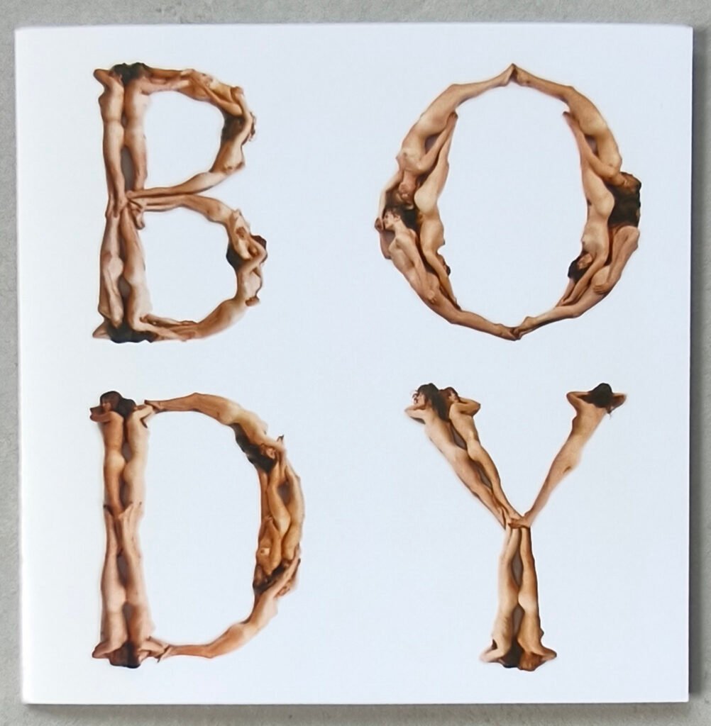
Beeke’s answer was to take that future and undress it. Working with his then-wife, photographer Anna Beeke, and photographer Geert Kooiman, he built an entire alphabet — later called Body Type, though everyone still calls it the Nude Alphabet or Blote Meisjes Alfabet — out of twelve nude women photographed from directly overhead, arranged into the exact serif letterforms of a classic Baskerville typeface.
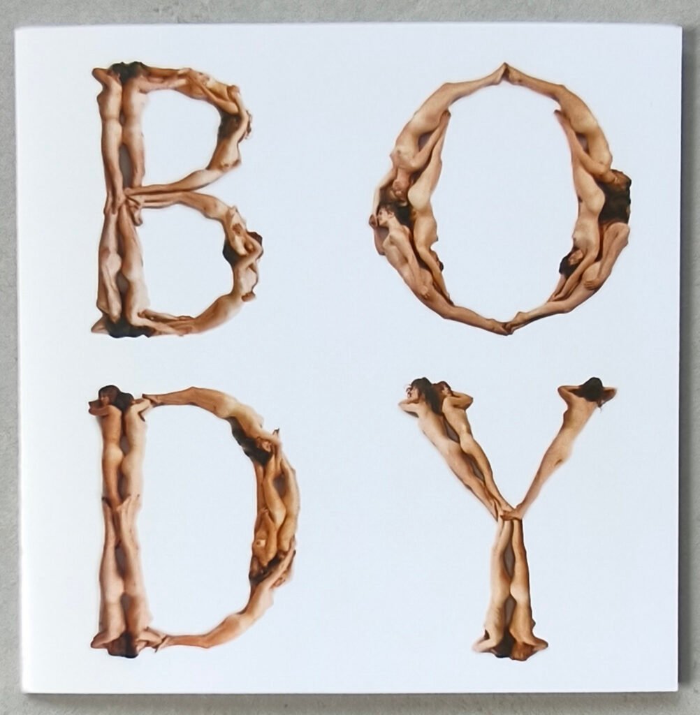
Where Crouwel had stripped the letter down to circuitry, Beeke rebuilt it from the human body, aiming to celebrate the sensual curves and perfect proportions of classical letterforms rather than to shock for shock’s sake.
The shoot itself, held in the Rietveld Academy’s gym, has become part of Amsterdam folklore. The models had been recruited after performing nude at the opening of a “cosmic center” at Paradiso, and photographer Ed van der Elsken — whose young daughter happened to be posing as the comma — dropped by and captured the loose, unbothered mood of the session. Beeke later described that era simply as one where the constant urge was to fling every window open.
It worked. The alphabet — published in 1970 in the experimental Kwadraat-Blad printing series — turned a scrappy independent designer into an international name, and gave Amsterdam one more piece of evidence that it really was a city where anything went.
Decades later the alphabet came back to bite someone else: in 2007, the fashion house Louis Vuitton used near-identical nude letterforms, credited to a different artist, to spell out its own name across a Champs-Élysées storefront and a companion book. Beeke sued for copyright infringement. Vuitton apologized and dropped the images — a small, satisfying coda to a piece of work that had spent forty years being imitated, never equaled.
Total Design, and thirteen years of learning to leave
Beeke’s career wasn’t only outrage. From 1976 he spent a stretch as deputy director at Total Design, the Amsterdam agency that had essentially invented the buttoned-up, systems-driven house style of Dutch corporate design — the same rational tradition Crouwel represented. It’s a strange pairing on paper: the street fighter inside the temple of the grid. He stayed until 1981, then broke off to run things his own way, eventually formalizing that independence as Studio AnthonBeeke in the late 1980s.
Whatever Total Design taught him about discipline, he brought it back to his true medium fully intact: the poster, made by hand, with a camera, scissors, and a knack for reducing an entire three-hour play to a single unbearable image.
Theatre’s favorite provocateur
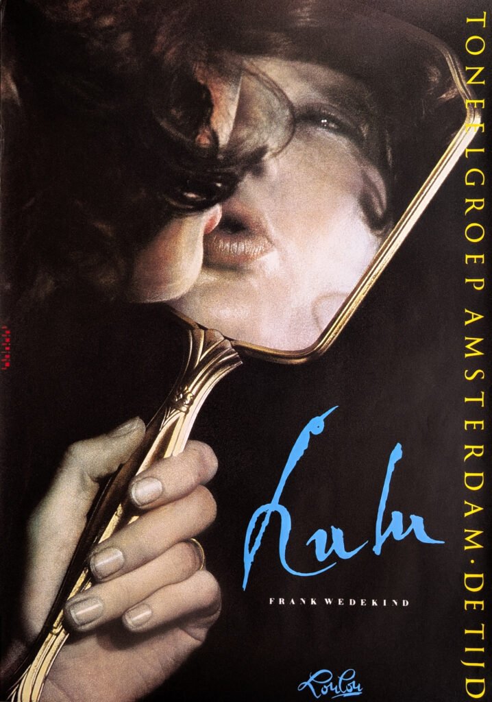
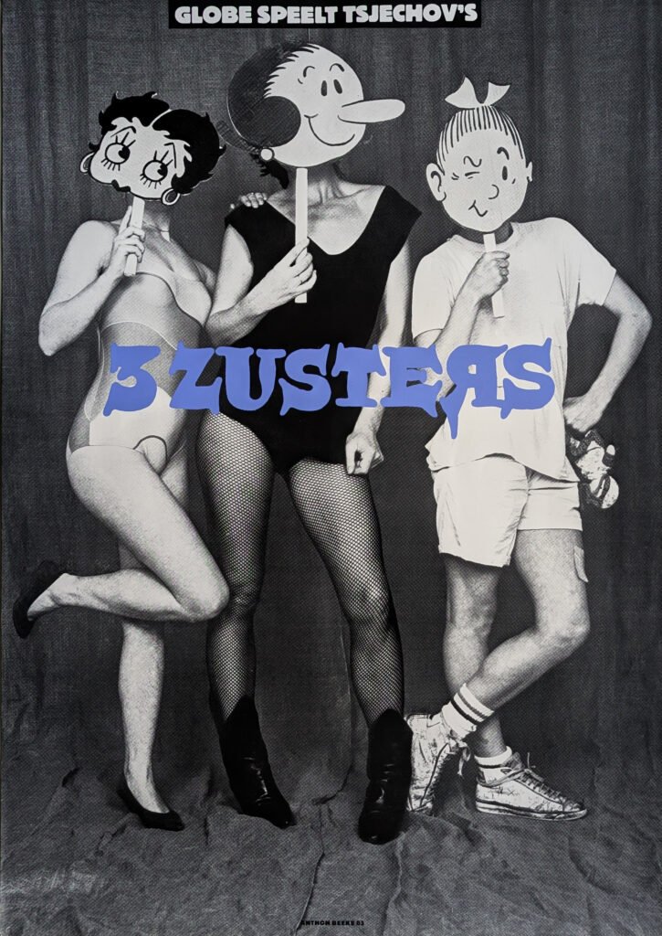
Beeke’s most notorious body of work came through theatre, and it started with a friendship. In the late 1970s he began designing for Zuidelijk Toneel Globe under its director Gerardjan Rijnders, a man building his own reputation for handling classic plays roughly. Their early posters — for La Casa de Bernarda Alba, Glück, Leonce und Lena — were softer and more poetic than what came later, but the ingredients were already visible: bare breasts, tongue-kissing couples, a general randiness that made theatre marketing look nothing like theatre marketing.
Then, in 1980, came the poster that defined him for good: for Troilus and Cressida, Beeke photographed a woman bent forward, genitals in full view, and put it on walls across the country. It is still cited as one of the most confrontational pieces of graphic design the Netherlands has ever legally hung in public.

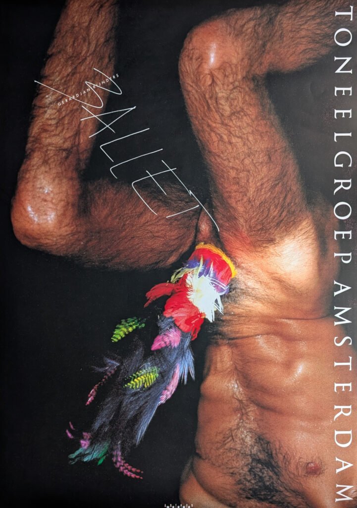
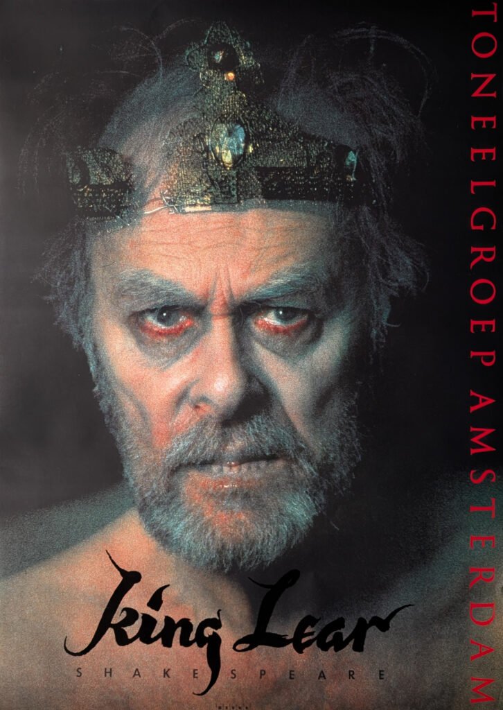
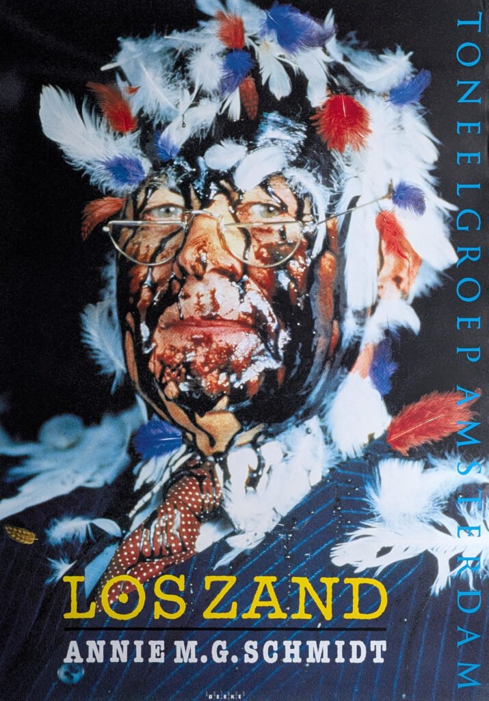
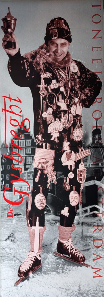
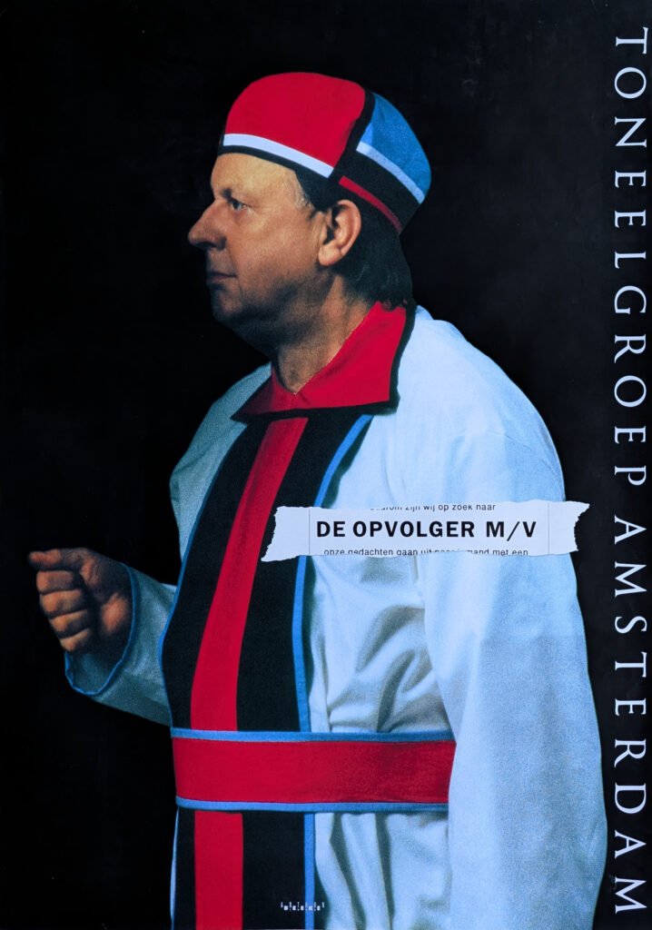
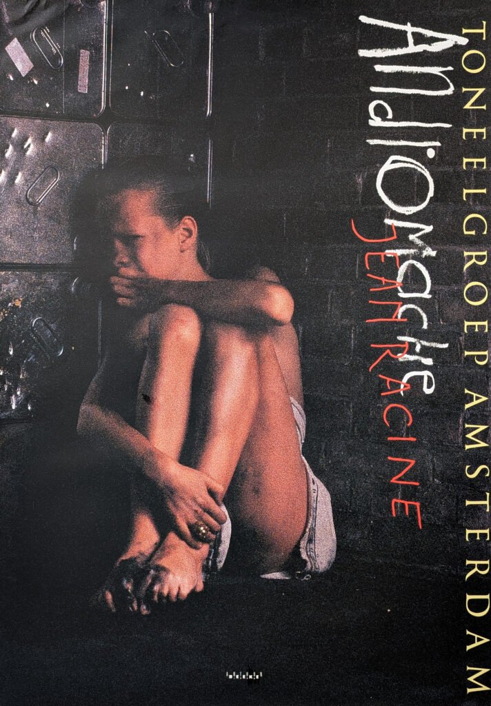
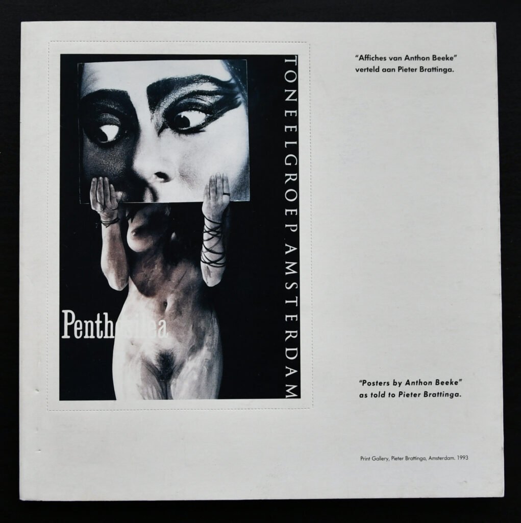
When Rijnders was appointed head of Toneelgroep Amsterdam — the country’s biggest theatre company — in 1986, he brought Beeke with him as house designer, and for roughly fifteen years the two of them redefined what a theatre poster could get away with. Beeke gave the company some of its most-awarded images, including Count Your Blessings (1993), which won the Theatre Poster Prize, and Ballet, inspired by Gluck’s Orfeo ed Euridice, generally considered the single most famous poster he ever made.
He was candid about what the sexual imagery meant to him. In one interview he described the more explicit posters — the ones showing genitals for Toneelgroep Amsterdam — as a kind of confession from a man to women, an admission of the part of masculinity that isn’t exactly noble but is, he insisted, entirely natural. He wasn’t interested in provoking constantly, either; he compared indiscriminate shock tactics to walking around with a hot poker, annoying rather than effective. The trick, as he saw it, was rationing the outrage so that when it landed, it actually meant something.
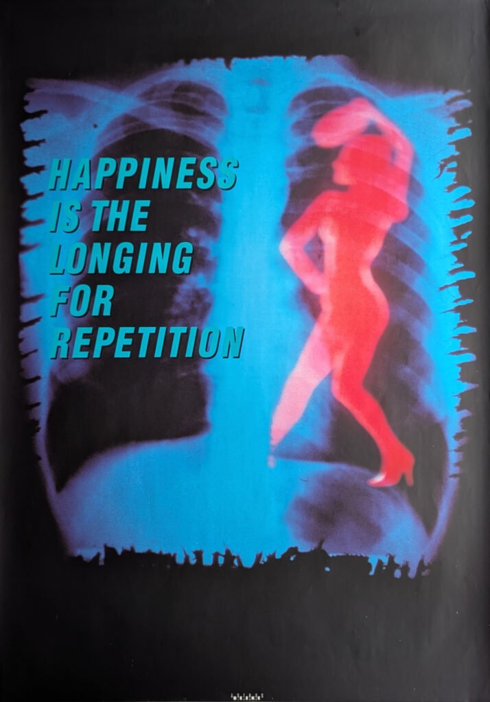
He was also a minimalist with words. Beeke stripped so much text off his posters that Toneelgroep Amsterdam sometimes had to print a second poster just to tell people what was actually playing and when.
Beyond the body
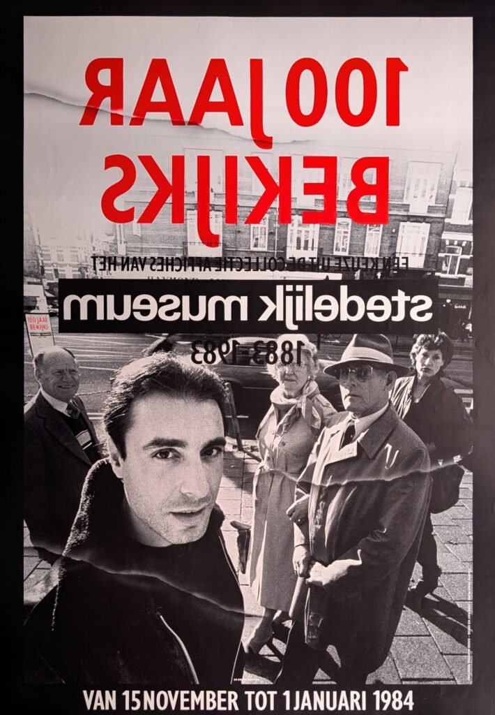
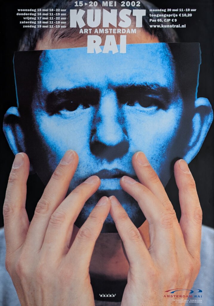
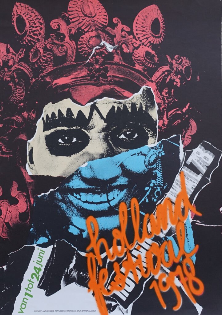
It would undersell Beeke to reduce him to nudity and shock. He renamed the Holland Festival’s identity to the vowel-less HLLND FSTVL in 1995 because he thought it communicated better than the full spelling. He photographed the director of a major Dutch museum with a bloodied, bandaged head to make a point about the fragility of the arts. He reduced the beloved children’s character Nijntje (Miffy) to a single wide-set eye and a cross-shaped nose for a museum poster, and somehow it was unmistakably still Miffy. And in 2009 — the same year he suffered the stroke that would eventually end his active career — he produced a Glas Alfabet, an alphabet built from sperm, a late-career echo of the Nude Alphabet that had started it all forty years earlier.
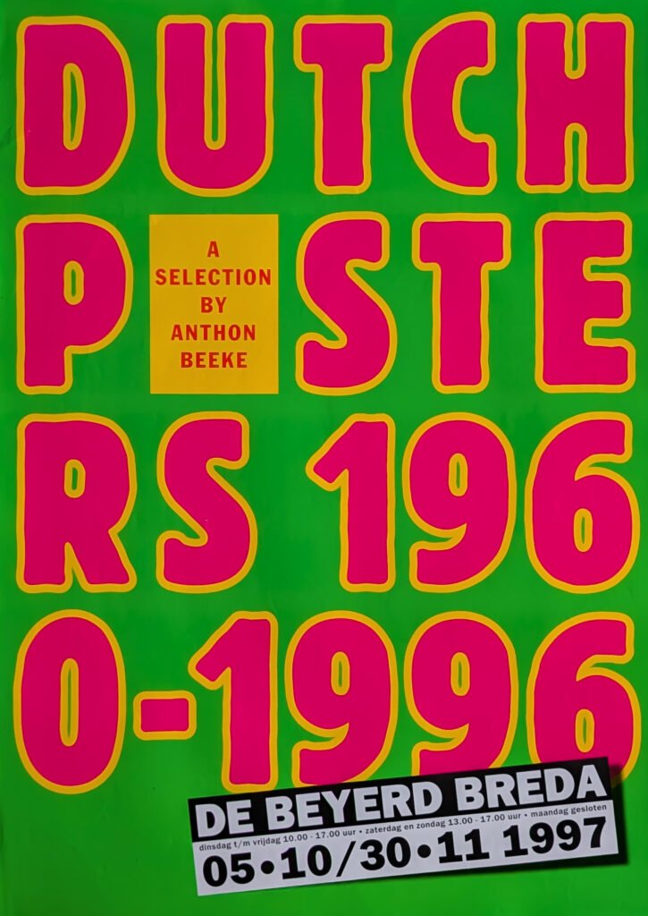
He also served, tellingly, as a kind of elder statesman and curator of the very medium he’d spent his career detonating. He compiled and edited two landmark overview books, Dutch Posters 1960-1996 and its sequel Dutch Posters 1997-2017, sifting through thousands of submissions to select the poster designs he felt captured the country’s design tradition — the same tradition running from Piet Zwart and Willem Sandberg through to Crouwel, the man whose rational alphabet had once provoked him into inventing his own.
The end, and what stuck around
Beeke closed his studio in 2010 after his 2009 stroke. He died on 25 September 2018 in Amsterdam, from a cerebral infarction, at 78 — reportedly just as the final proofs of Dutch Posters 1997-2017 had been approved and sent to the printer, turning the book into an unplanned tribute. He was survived by his partner, the internationally influential trend forecaster Lidewij Edelkoort, who once summed him up as someone who thought and acted absurdly, a cultural clown who could provoke a crowd, and whose entire existence had been shaped by graphic design.
That’s not a bad epitaph for a man who spent his career insisting that a poster has one job: to grab you before you even know what’s happening, in the one or two seconds you give it while walking past. Anthon Beeke never gave the Netherlands a second chance to look away — and, for the most part, the Netherlands never really wanted one.
there are over 80 Beeke items available at www.ftn-books.com