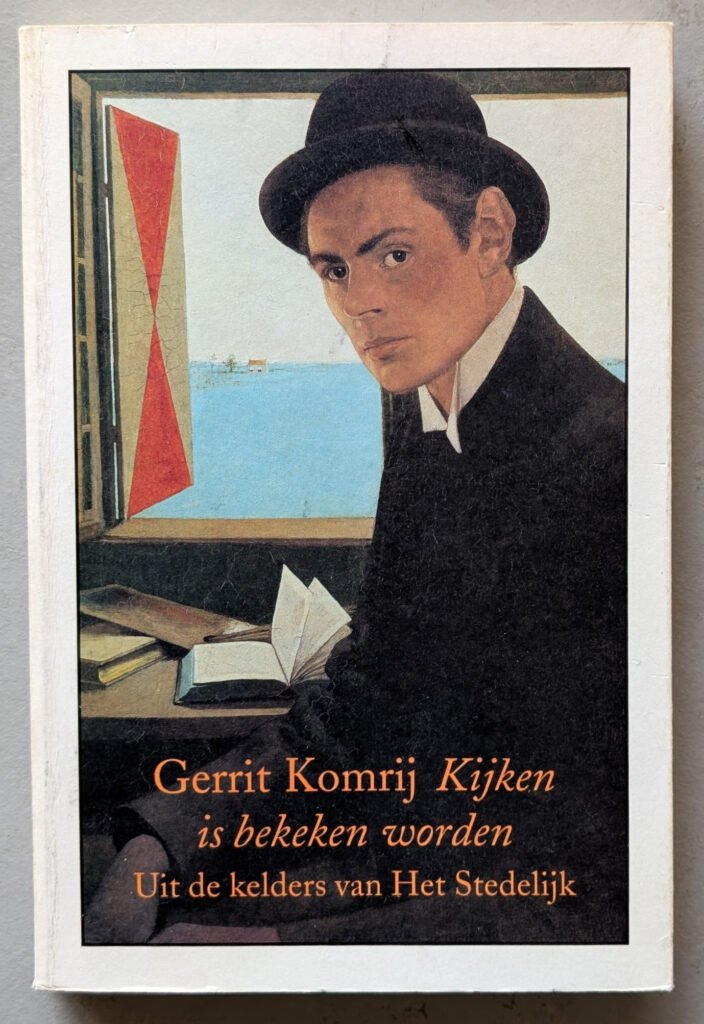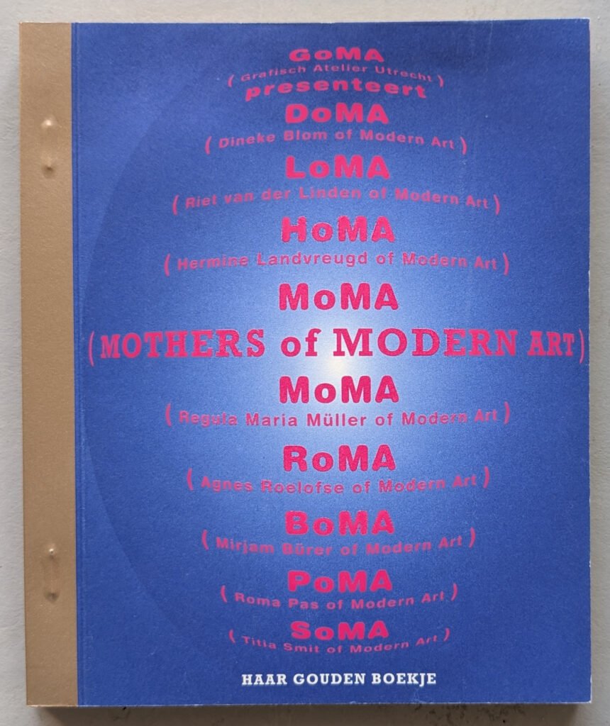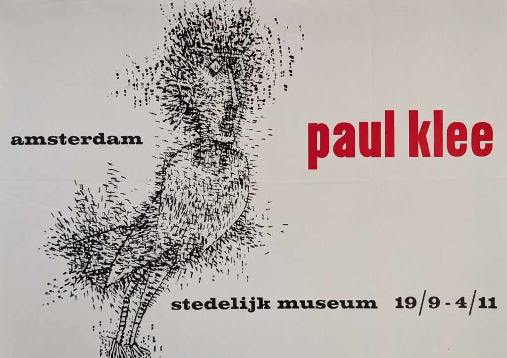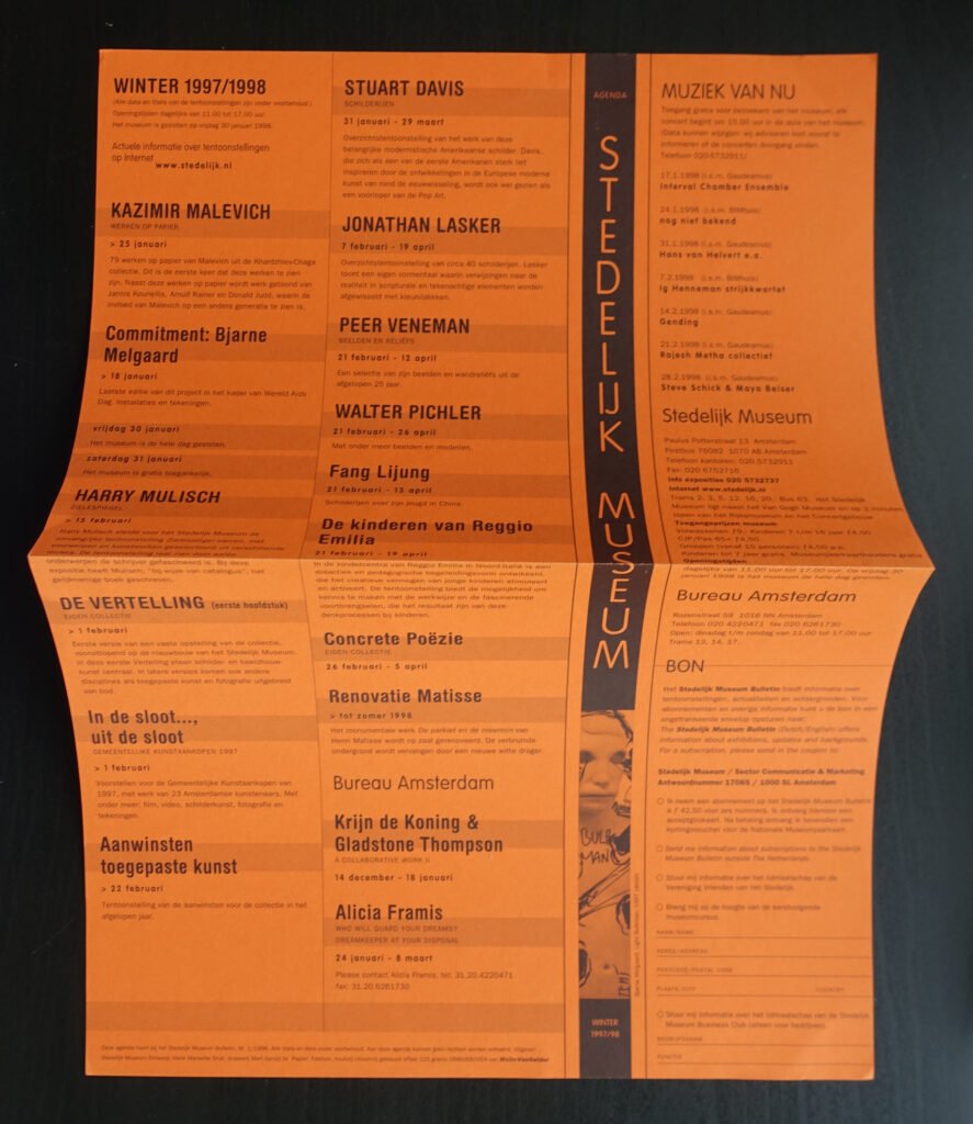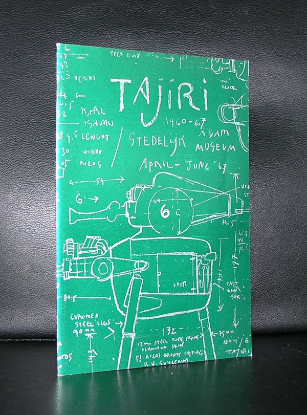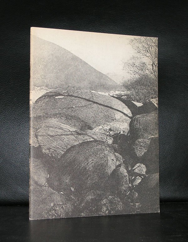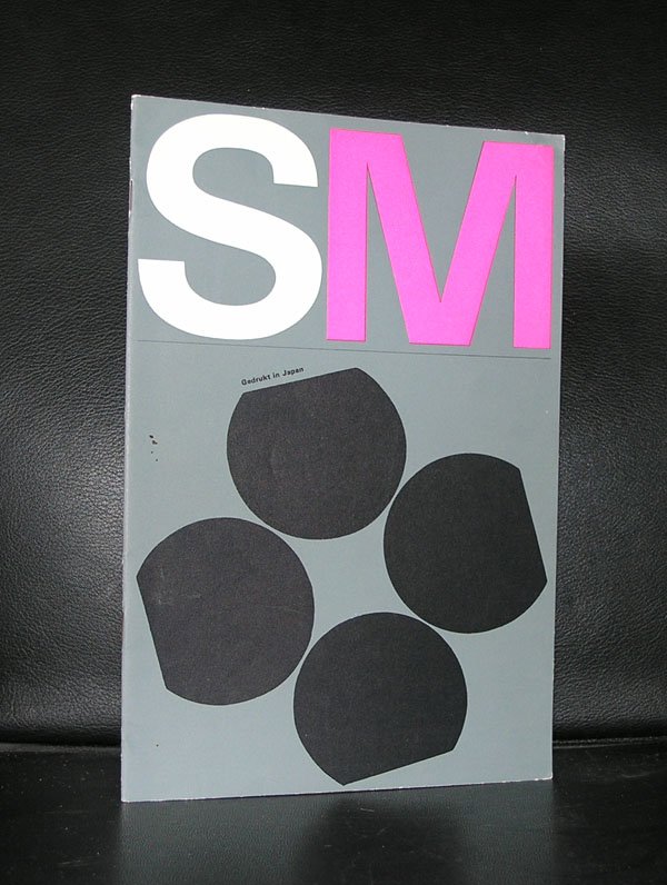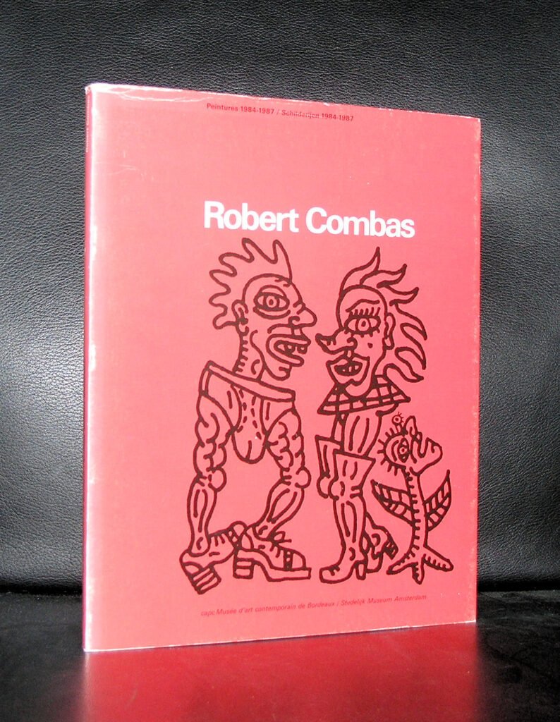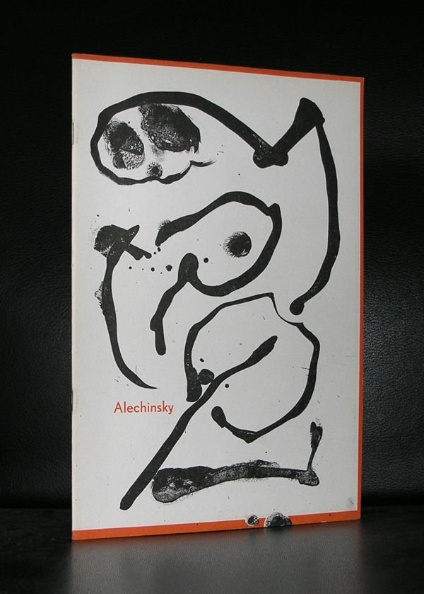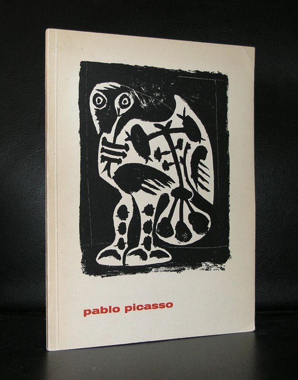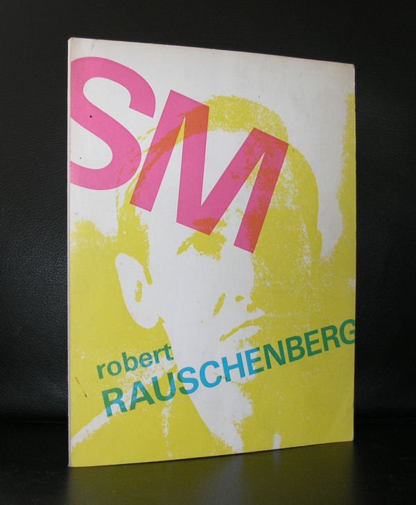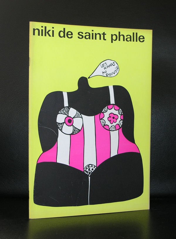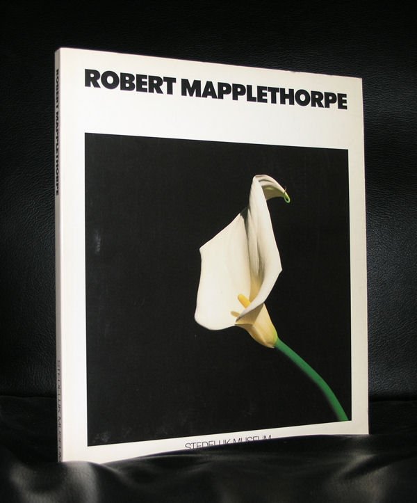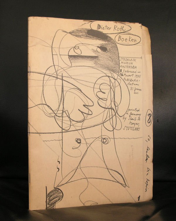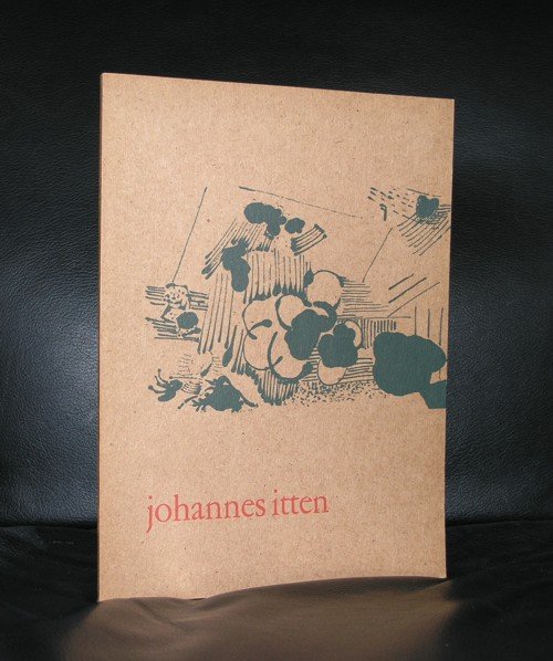

ww.ftn-books.com has probably the largest collection of Stedelijk Museum related material in the world. Nearly a 1000 items available.
Search for “stedelijk museum ” at www.ftn-books.com or click here
The White Cube Revolution: Why the Stedelijk Museum Is Europe’s Most Important Contemporary Art Museum
Walk into most 19th-century European museums and you’ll find dark, ornate rooms stuffed with gilt frames, velvet ropes, and an unspoken rule: art is sacred, and you are a guest who should whisper. Then walk into the Stedelijk Museum Amsterdam — and understand why it broke that mold entirely, and why the ripples are still shaping how museums look and feel today.
The Stedelijk isn’t just old. It isn’t just full of masterpieces by Van Gogh, Malevich, Chagall, and Warhol. What makes it arguably the most influential contemporary art museum in Europe over the last century is something rarer: it treated design itself as an art form, and let two visionary figures — Willem Sandberg and Wim Crouwel — turn the museum’s identity into a masterpiece in its own right.
A 19th-Century Building With a Radical Idea Inside
The museum opened its doors on 14 September 1895, housed in a Dutch Neo-Renaissance building designed by architect Adriaan Willem Weissman. <cite index=”5-1″>It was built to house a collection donated by Sophia Adriana de Bruyn, under an organization founded in 1874 to create a public collection of contemporary art.</cite> Respectable. Handsome. Utterly conventional — at first.
Everything changed when a young curator named Willem Sandberg started rethinking what a museum could be.
Sandberg: The Director Who Designed His Own Museum
Willem Sandberg (1897–1984) is one of the great untold stories in art history — part typographer, part resistance fighter, part museum revolutionary. He began working for the Stedelijk in 1928, became curator in 1937, and would go on to define what a modern museum could look, feel, and function like.
During WWII, Sandberg didn’t just protect the museum’s collection — he hid it. Sensing the Nazis’ hatred of modern art, he built an enormous bunker in the dunes near Castricum, where more than 500 collections, including Rembrandt’s rolled-up Night Watch, were secretly stored for safekeeping He also used his design skills for something far more dangerous than exhibition posters: forging documents that helped Jewish citizens escape deportation.</cite> He went into hiding himself after helping plan the bombing of the Amsterdam public records office to slow the Nazi registry system. For this, Sandberg was later recognized as Righteous Among the Nations
After the war, he became director (1945–1962/63) and completely reinvented the museum. In 1938 he had already stripped the ornate interiors and painted the rooms white — creating one of the first “white cube” gallery spaces inside a historic building=, a look now considered the global default for contemporary art display. He didn’t stop at the wallshe introduced an education program and turned the museum into an inviting environment with a library, reading room, restaurant, and an auditorium for film and music, and replaced the museum’s solid wooden entrance doors with huge transparent glass ones— a literal and symbolic opening-up of the institution to the public.
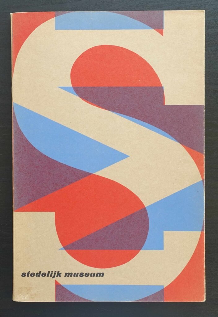
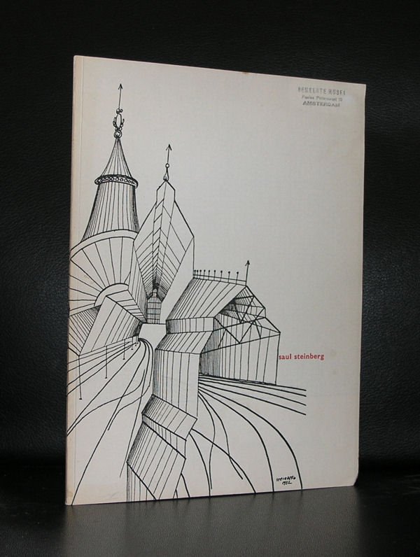
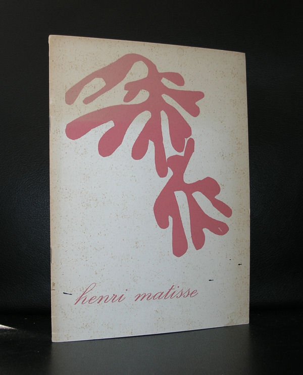
But Sandberg’s most singular contribution was this: as director, he was also the museum’s graphic designer. He personally designed almost all of the posters, catalogues, and graphic material for the museum, producing 380 posters and more than 250 catalogues in a style built on bold typography, bright colors, torn-paper shapes, and reused imagery . A respected British design magazine of the era, Typographica, called the Stedelijk’s publications the most stimulating examples of creative typography produced anywhere in postwar Europe.
Under his leadership the museum also expanded its collecting ambitions dramatically — acquiring major modern works alongside photography, design, and industrial objects, and building what became one of the most important collections of modern art in Europe
Crouwel: The System That Followed the Soul
If Sandberg’s era felt handmade and emotional, what came next felt engineered — deliberately.
In 1963, new director Edy de Wilde brought in graphic designer Wim Crouwel to become the Stedelijk’s sole visual identity designer, a role he held for over two decades. The two worked together until De Wilde’s departure in 1985, during which Crouwel created some 400 posters and over 300 catalogues for the museum — arguably the most important body of work in his career, one he considered the most notable client he ever had.
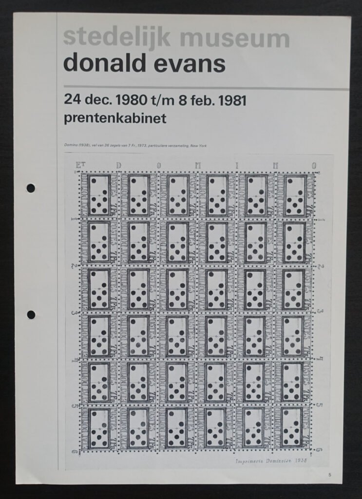
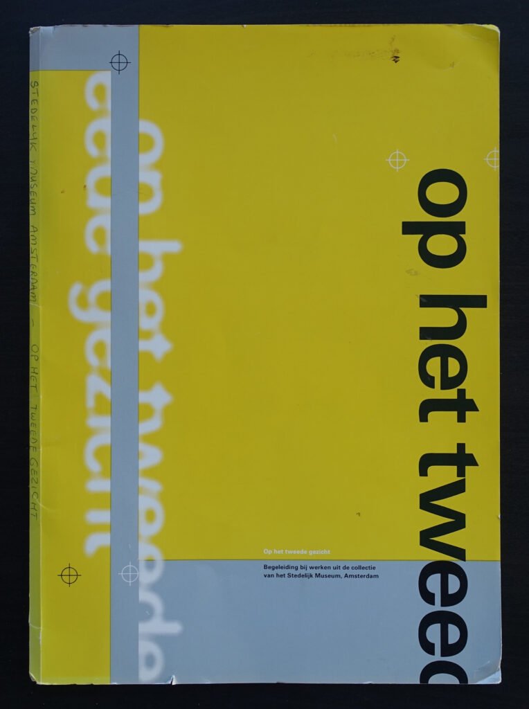
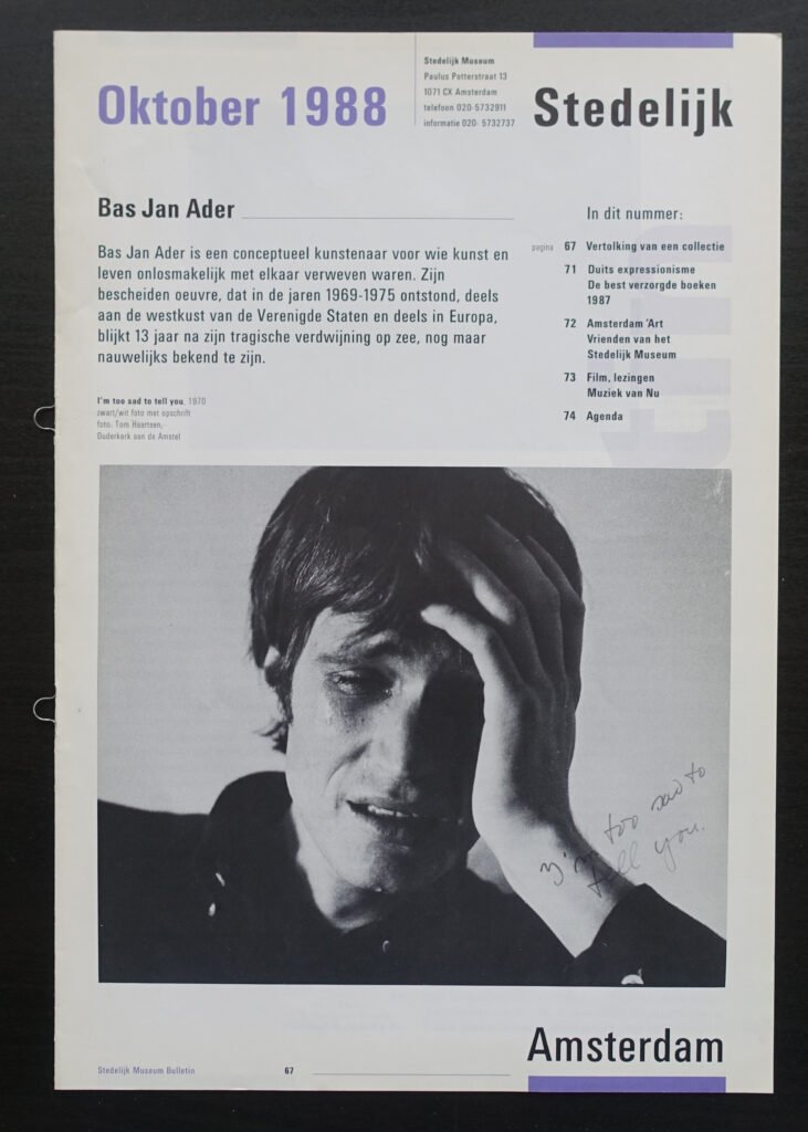
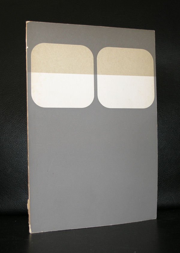
Where Sandberg tore paper and splashed color, Crouwel imposed order. He was a lifelong advocate of the grid system, deeply shaped by the rational, minimalist Swiss school of graphic design Everything — posters, catalogues, signage — followed strict typographic logic, earning him the nickname “Mr. Gridnik.”
Crouwel’s most radical creation grew out of a strange technical problem. With the space age and early computer typesetting technology in mind, he designed the experimental New Alphabet in 1967 — a typeface built entirely from horizontal and vertical strokes, designed for machines that could barely render curves. It looked like a glimpse of a digital future decades before anyone owned a computer, and it remains one of the most cited typefaces in design history.
The contrast between Sandberg and Crouwel is really the story of 20th-century Dutch design in miniature: intuition versus system, warmth versus rigor, the designer-as-artist versus the designer-as-engineer. Both approaches, remarkably, came from the same institution — and both are still cited today as foundational to how museums communicate visually.
The Building Keeps Evolving Too
The design story didn’t stop with posters. In the 2000s, the museum needed a major expansion, and the winning design came from Benthem Crouwel Architects — led by Mels Crouwel, Wim Crouwel’s son. The renovation and new wing were completed in 2012</cite>, giving the Stedelijk its now-iconic white, bathtub-shaped extension jutting onto Museumplein — a building that echoes Sandberg’s original “white cube” ethos while giving the museum a striking, unmistakably modern face. It’s a rare, almost poetic detail: a father defined the Stedelijk’s graphic identity, and decades later his son helped redefine its physical one.
Why It All Still Matters
Plenty of museums have great collections. Fewer have shaped the very language of how contemporary art is displayed, marketed, and experienced. The Stedelijk did both — and did it through people who treated design not as decoration, but as the museum’s actual voice.
Sandberg made the museum feel human, accessible, alive. Crouwel made it feel systemic, modern, and unmistakably branded before “branding” was even a common word for it. Together, their decades of work turned the Stedelijk from a provincial 19th-century building into a laboratory for what a museum’s identity — visually, spatially, and philosophically — could be. That’s the quiet, extraordinary reason the Stedelijk keeps coming up in conversations about the most important contemporary art museums in Europe: it didn’t just collect the art of its century. It designed the way we look at it.
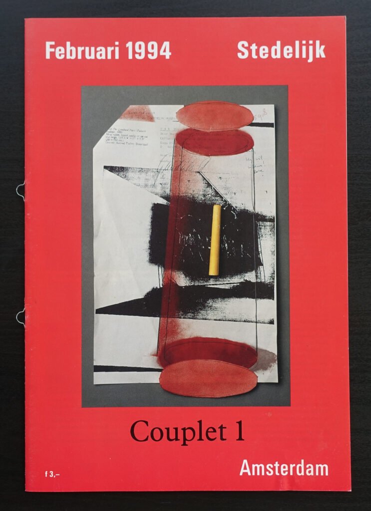
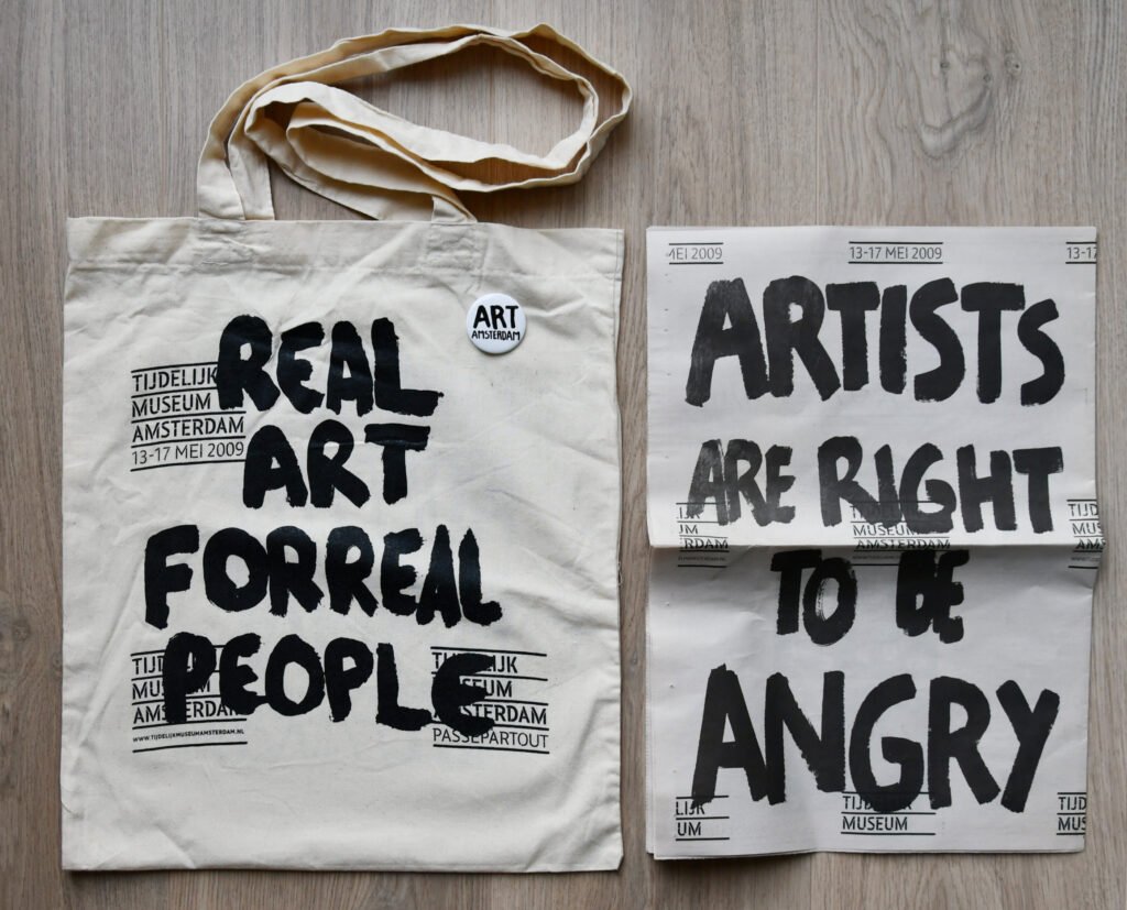
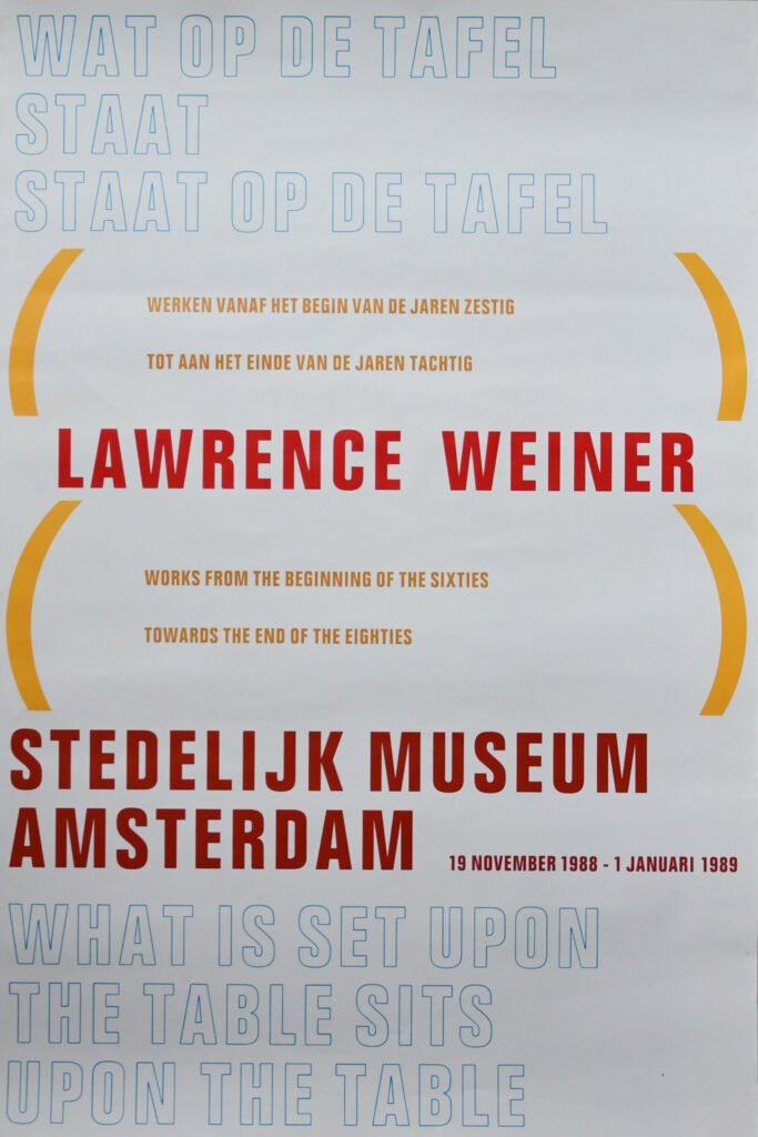
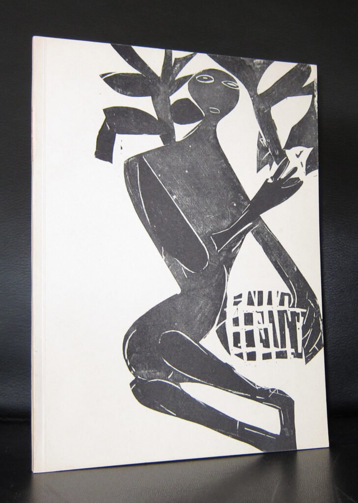
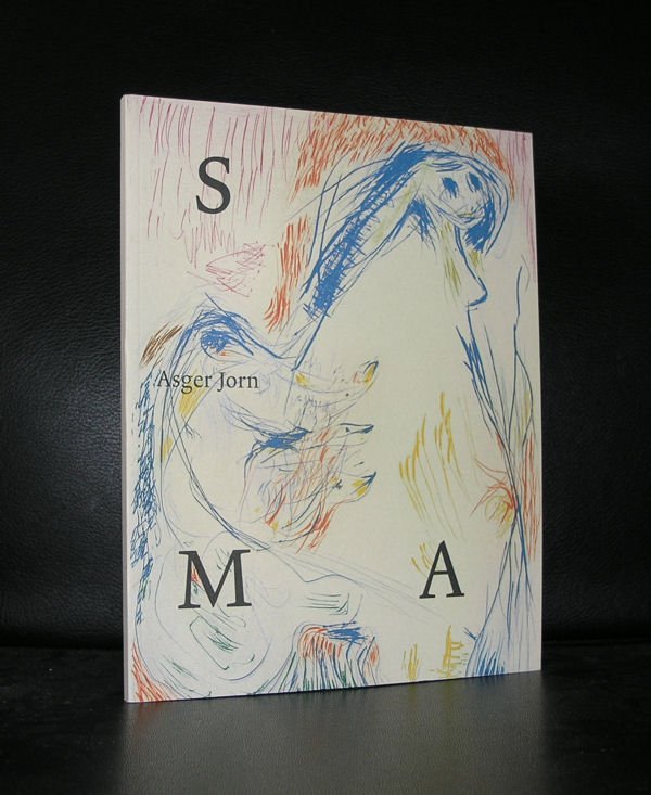
some examples of iconic Stedelijk Museum publications and for morre go to www.ftn-books.com