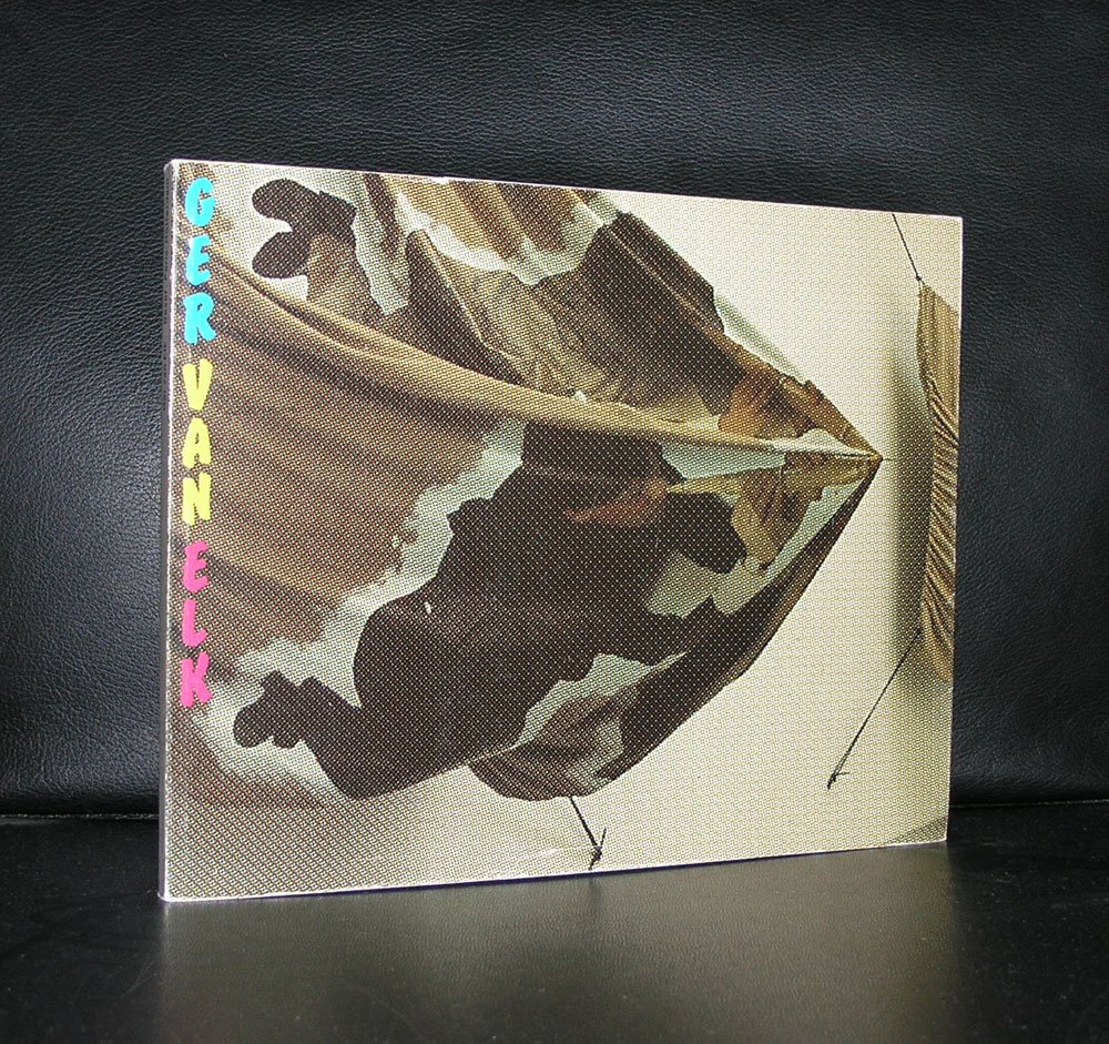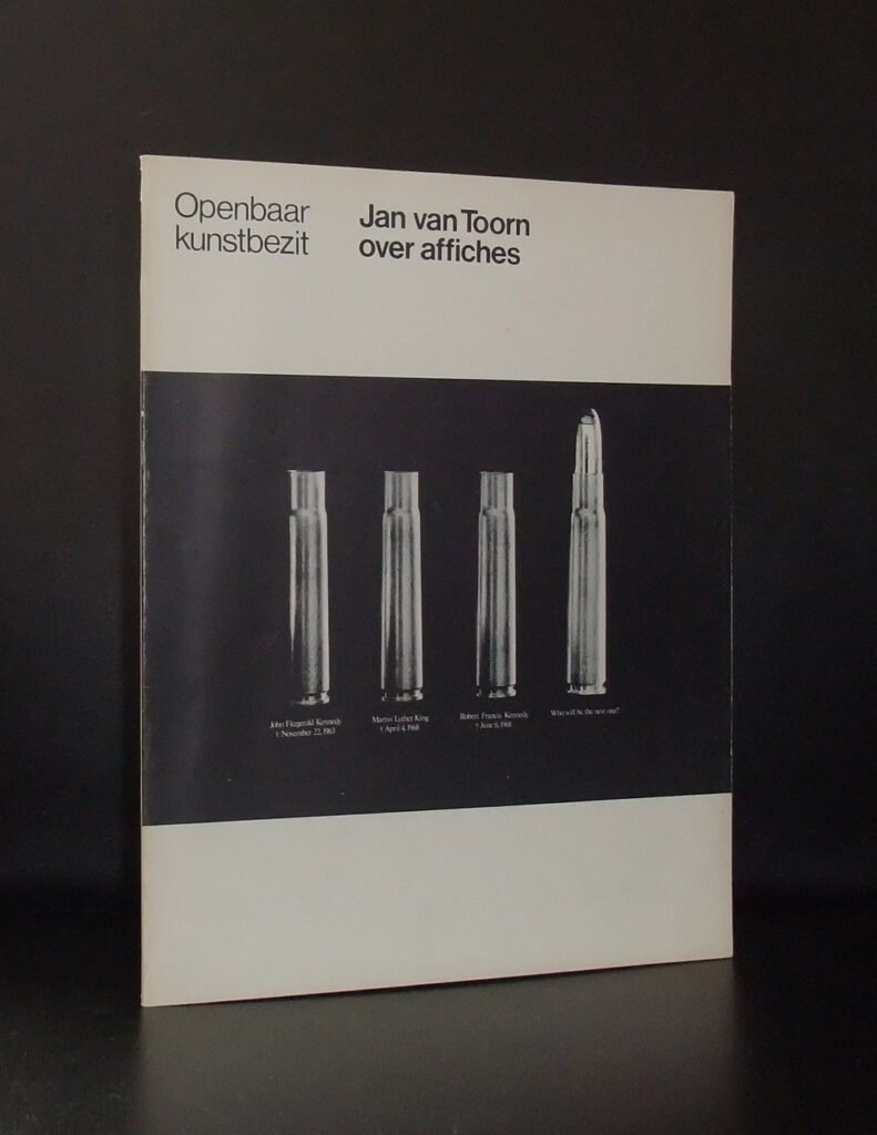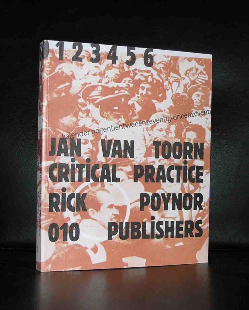

For a large number of van Toorn related items please visit www.ftn-books.com or click here
and search for “Toorn”
Jan van Toorn is one of those designers whose work makes you rethink what a poster or a book cover is actually for. He’s often bracketed with Wim Crouwel and Willem Sandberg as one of the great postwar Dutch design figures, but he spent much of his career deliberately picking a fight with what they stood for — and that fight is the juiciest part of the story.
The rebel against the grid
Crouwel, nicknamed “Mr. Gridnik,” believed in cool, systematic, almost mathematical design — Helvetica-adjacent, neutral, letting content speak through pure structure. Van Toorn thought that neutrality was a lie. He believed every design choice is an interpretation, a political and social act, whether the designer admits it or not. So instead of hiding his hand, he pushed it forward: rough photomontage, deliberately “ugly” or jarring juxtapositions, type that argues with the image instead of politely captioning it.
This came to a head in a legendary public debate in 1972 in the magazine Kunst en beleid, on the pages of the Dutch press, where van Toorn and Crouwel argued out loud about the designer’s responsibility to society. Crouwel: the designer serves the message with clarity and order. Van Toorn: the designer is a participant, even a provocateur, who should expose contradictions rather than smooth them over. That argument is still taught in Dutch design schools as the foundational debate of the field — commitment versus neutrality.
Van Abbemuseum: his laboratory
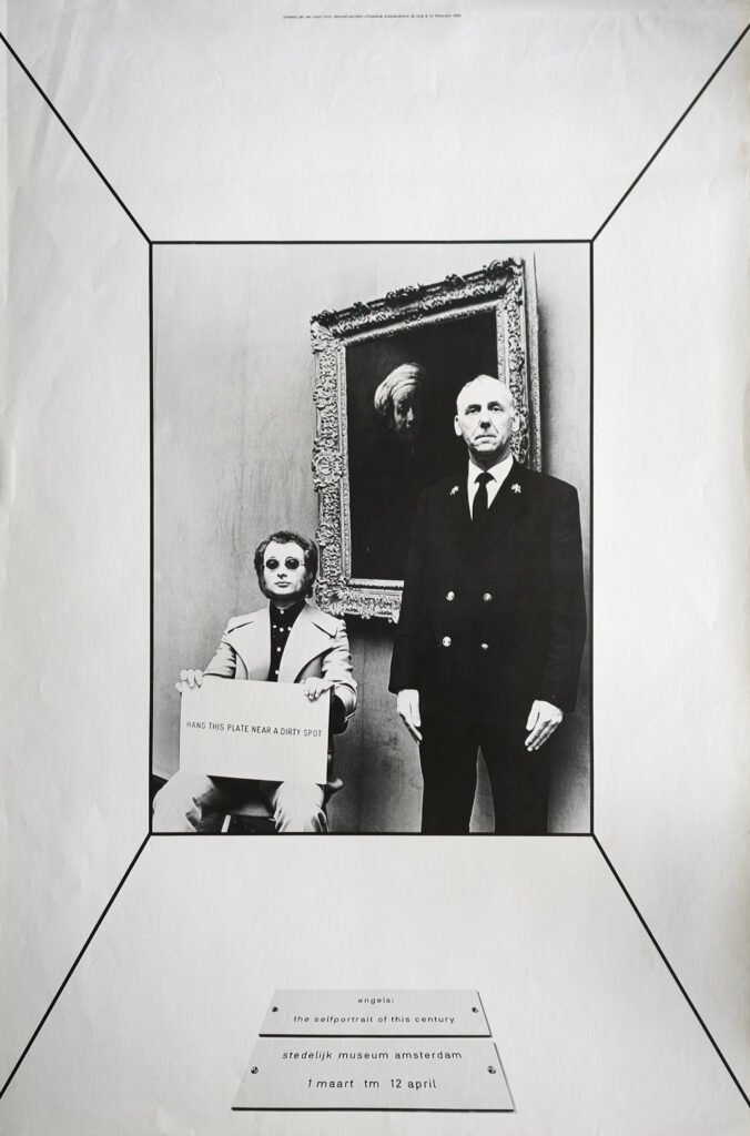
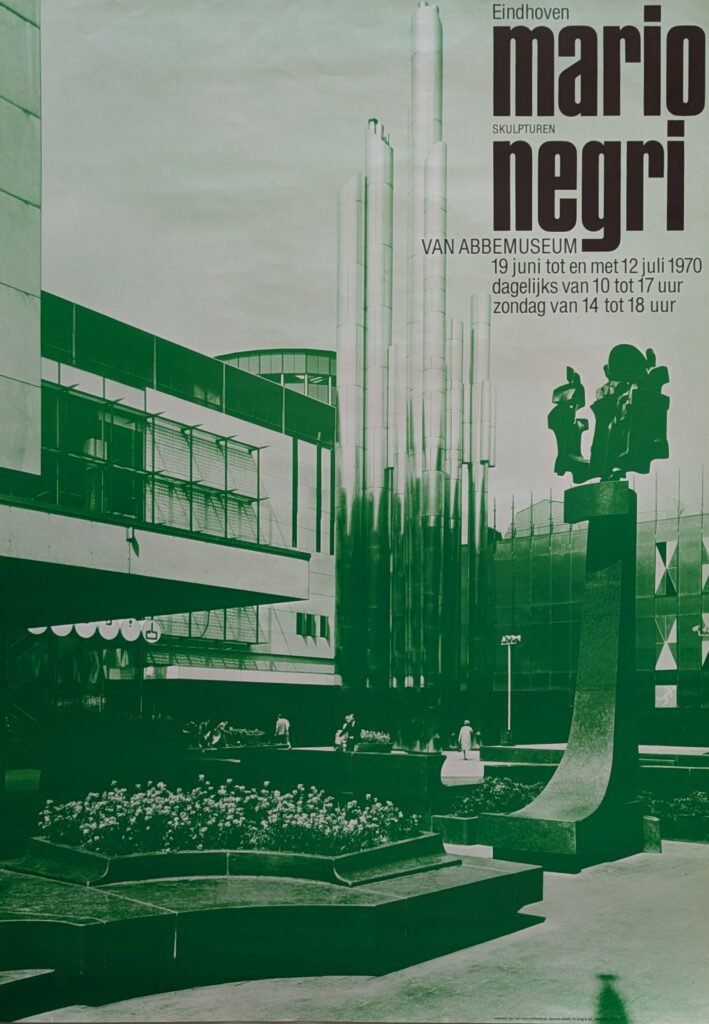
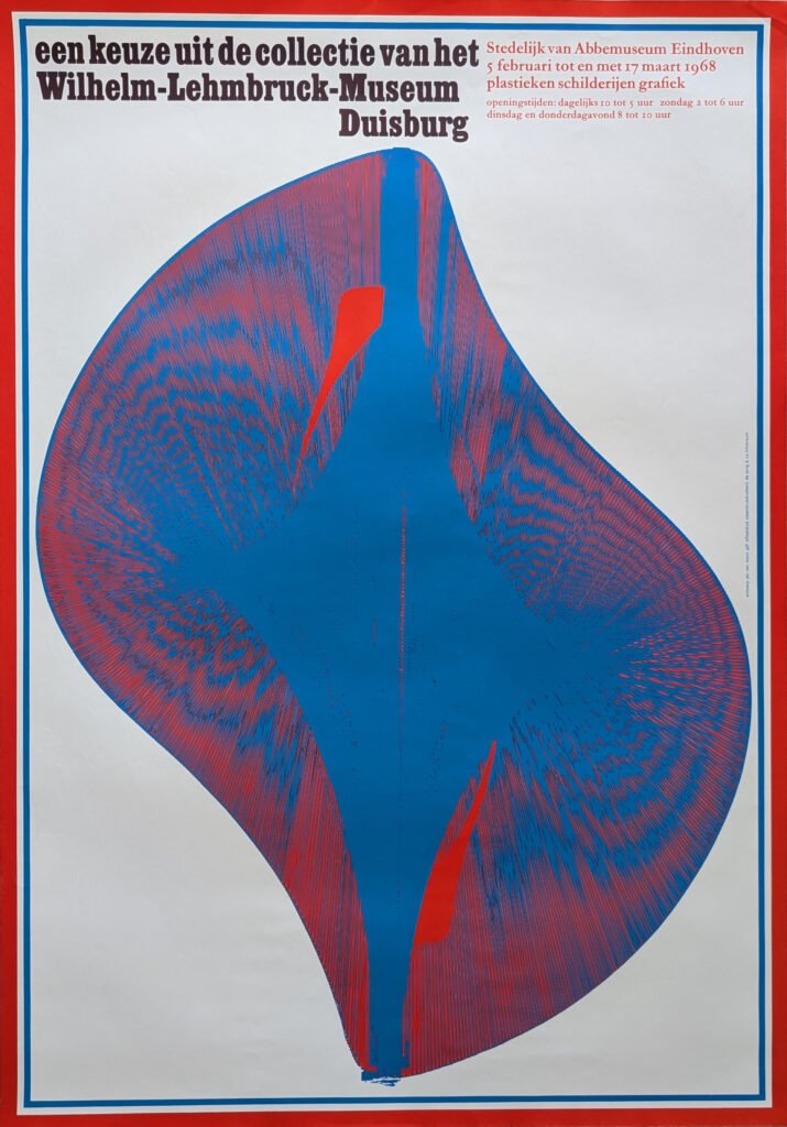
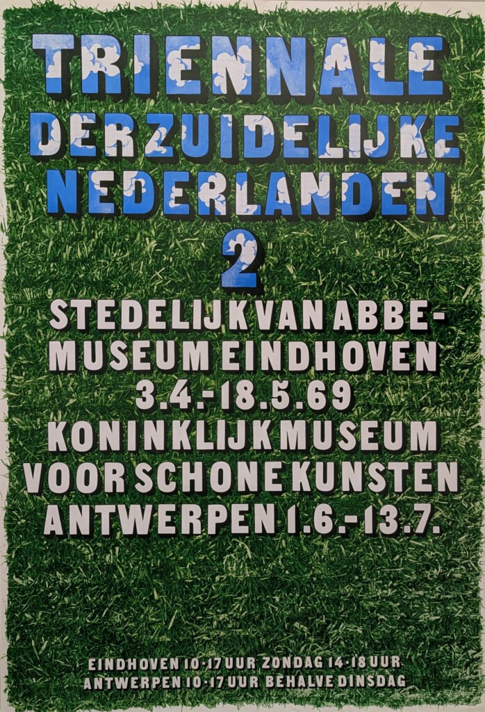
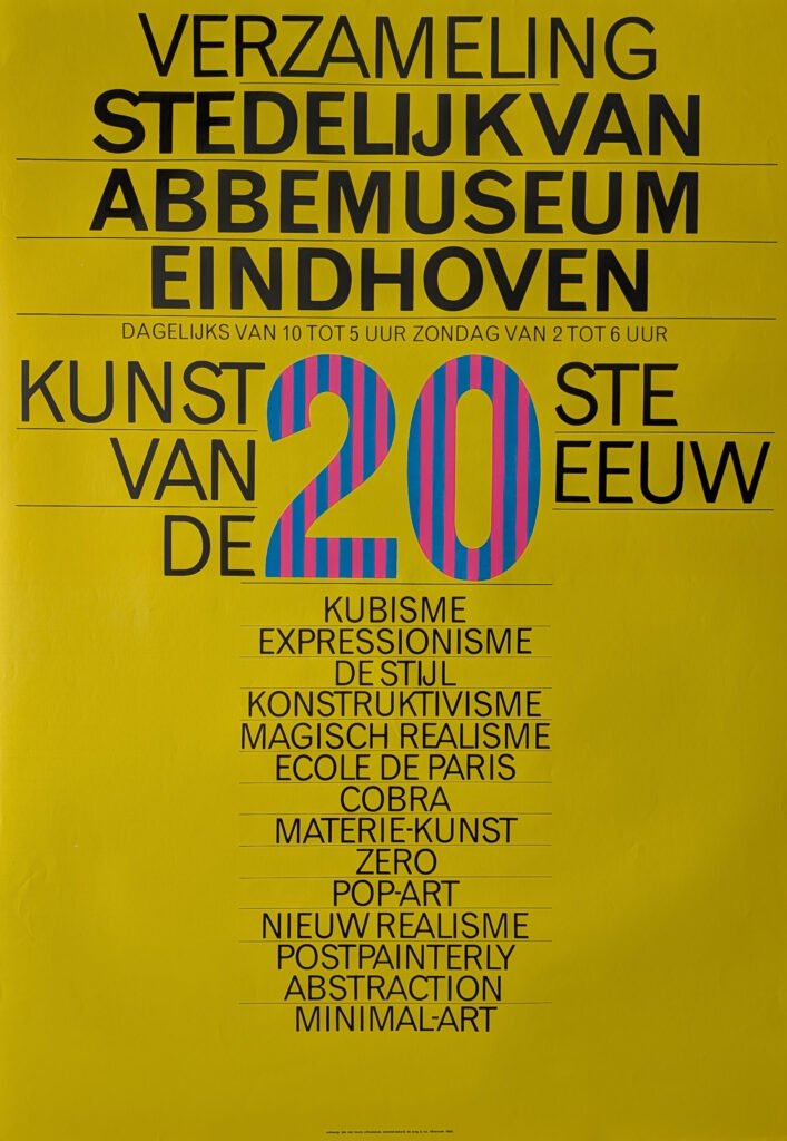
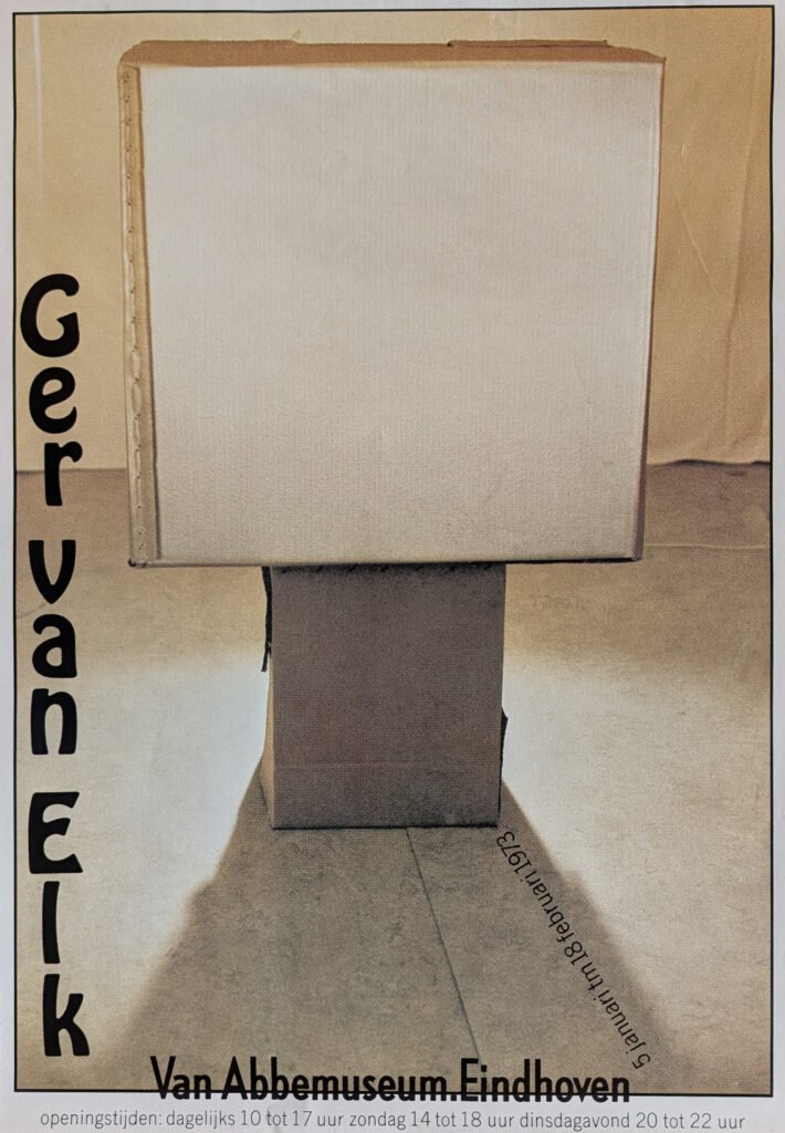
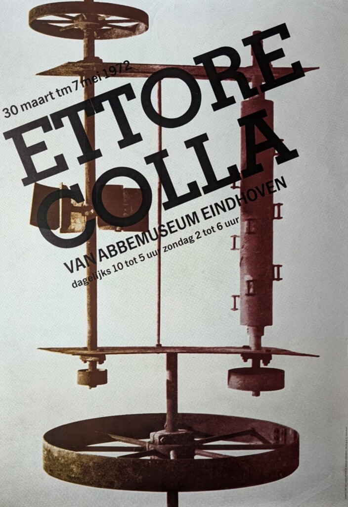
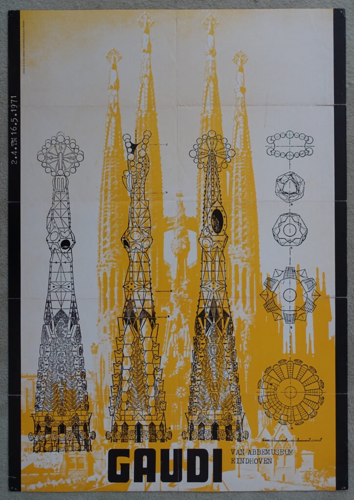
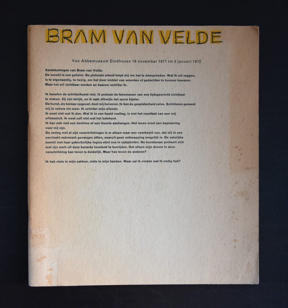
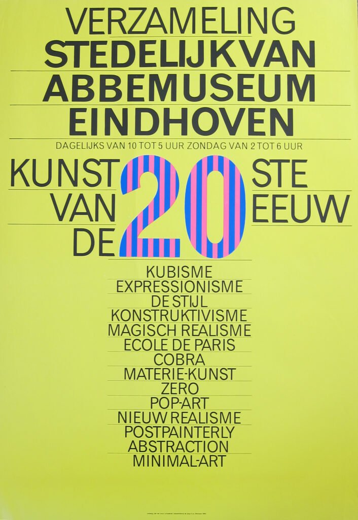
Eindhoven’s Van Abbemuseum became his workshop through the 1960s and 70s. Instead of clean, minimal exhibition posters and catalogues, van Toorn built layered, sometimes deliberately clashing compositions — cropped photographs, overprinted type, off-register color, images that seemed to interrupt each other rather than harmonize. It looked closer to political pamphleteering or documentary collage than polished museum branding. That was exactly the point: art shouldn’t be presented as a neutral consumer good, and neither should the graphic material announcing it.
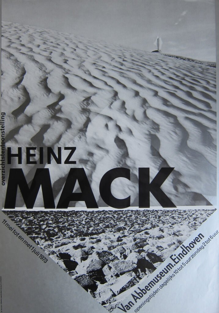
Commitment as a design method
Van Toorn called his approach something close to “engaged” or “committed” design — he wanted the viewer to feel friction, to notice they were being addressed rather than simply informed. His covers for De Volkskrant, his book designs, his PTT (Dutch postal service) work all carry this same restlessness: nothing sits quietly on the page. Photographs are often disturbing, banal, or intentionally awkward rather than aestheticized. Type doesn’t decorate — it interrogates.
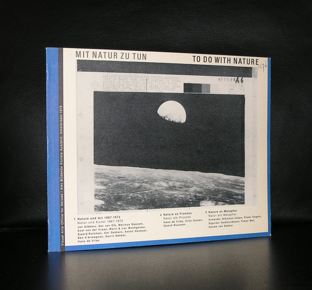
He drew on documentary photography, and he loved contradiction: elegant typographic structure sitting right next to a grainy, almost confrontational photo. It’s design that refuses to resolve into pure beauty because van Toorn thought pure beauty was itself a form of dishonesty — a way of anesthetizing the viewer against the real (often uncomfortable) content of the message.
Teacher, provocateur, institution
Beyond his own studio work, van Toorn taught for years at the Rietveld Academie and later directed the Utrecht School of the Arts (HKU), where he kept fighting the same battle: training designers to see themselves as authors and critics rather than neutral service providers. Generations of Dutch designers who came up in the 80s and 90s — including figures who’d go on to shape the more expressive, deconstructed style associated with Dutch graphic design internationally — were formed in that atmosphere of “design as argument.”
The legacy
What makes van Toorn a classic isn’t that he “won” the argument with Crouwel — Dutch design absorbed both currents, the rational and the confrontational, and kept them in permanent tension. It’s that he insisted, stubbornly and consistently across a fifty-year career, that a designer’s fingerprints should be visible on the page — that design is never just delivery, it’s always also opinion. In a field that so often prizes invisibility and polish, that’s a genuinely juicy, contrarian legacy — and it’s why his posters still look unsettled and alive instead of merely dated.
Here follows a nice selection of ca. 200 van Toorn items available at www.ftn-books.com