The Man Who Tore Up the Rulebook: Willem Sandberg and the Reinvention of the Museum

For the many Sandberg items www.ftn-books.com has available, click here
Walk into Amsterdam’s Stedelijk Museum today, and you’re standing inside an idea that one man spent thirty years fighting for: that a museum should be alive, welcoming, and unafraid of new art. That man was Willem Sandberg — a self-taught typographer, wartime forger, and the director who turned a sleepy Dutch municipal museum into one of Europe’s most influential homes for modern art.
Sandberg’s story is unusual because it refuses to sit in one lane. He was, at various points, a graphic designer, a museum administrator, a resistance fighter, and an accidental art historian. Somehow all of these turned out to be the same job.
An Aristocrat Who Didn’t Know What to Do With Himself
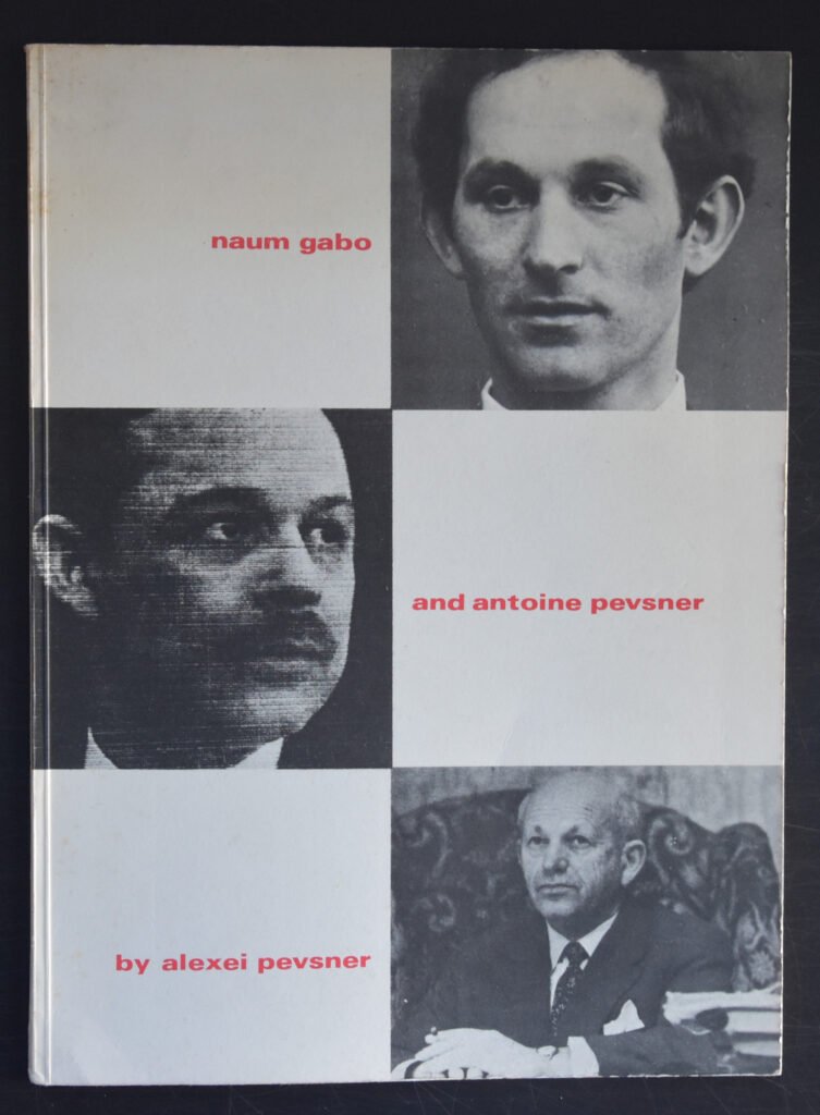
Willem Jacob Henri Berend Sandberg was born in 1897 in Amersfoort, the Netherlands, into a well-off family — he carried the aristocratic title jonkheer his whole life, though little about his later career suggests a man interested in privilege for its own sake. He studied art in Amsterdam, then did what a lot of restless young Europeans did in the 1920s: he traveled. He apprenticed with a printer in Switzerland, spent time in Paris, and in 1927 visited Vienna, where he studied Otto Neurath’s Isotype system — the pictorial method of presenting statistics that would later shape infographic design worldwide. On the same trip he visited the Bauhaus in Dessau and met the sculptor Naum Gabo, a pioneer of kinetic art.
He came home to Amsterdam without a design degree, but with an eye. In 1928, the Stedelijk Museum gave him his first typographic commissions, and a relationship began that would define the rest of his life.
For several years, that relationship was part-time. Between 1930 and 1935, Sandberg studied psychology at the University of Utrecht, and he took on other design work along the way, including projects with Piet Zwart, one of the leading figures of Dutch modernist typography. In 1932 he joined VANK, the Dutch Society for Arts and Crafts. By 1937 he’d been appointed curator at the Stedelijk, and the following year, assistant director. He was already, in his forties, considered a late starter — most of his defining work was still ahead of him.
War, Forgery, and a Burning Registry
Then the Netherlands was occupied.
In the pre-war years Sandberg had traveled to Spain in 1937, witnessing the country in the grip of civil war, an experience that seems to have sharpened his political instincts well before the German invasion of 1940 forced the issue. Once the occupation began, Sandberg joined the resistance. His printing background made him useful in the most literal way: he applied his design and technical skills to forging identity papers, work that helped Jewish friends and others escape deportation.
In 1943, he became part of a plot to destroy the official population records at Amsterdam’s Central Civil Registry Office — records the Nazis relied on to track down Jewish residents and resistance members. On March 27, 1943, resistance members disguised as policemen (Sandberg reportedly made their helmets himself) entered the registry, doused the archives in fuel, and set them ablaze. The forged papers his group produced were, by his own account, good enough that a specialist from the German investigation office in The Hague couldn’t easily spot the fakes. Sandberg would later call the forgery work “the best piece of typography I have ever done” — a line that says a great deal about how he thought of his craft: not as decoration, but as a tool that could genuinely change what happened to people.
The raid was betrayed. His co-conspirators were captured and executed; Sandberg escaped and spent the last stretch of the war in hiding, from December 1943 to April 1945, living under the assumed name Henri Willem van den Bosch. His wife and son were detained during this period. It was a harrowing time by any measure — and yet it produced some of his most significant creative work.
Isolated and stripped of materials, Sandberg began making a series of handmade pamphlets he called Experimenta Typographica: roughly eighteen or nineteen small books combining drawing, collage, and typographic experiment, made with whatever paper and tools he could scrounge. They weren’t intended for an audience. But they became, in effect, the sketchbook for everything he’d design at the Stedelijk over the next two decades — the torn paper edges, the bold primary colors, the willingness to let imperfection show. After the war, in recognition of his resistance work and his role in saving Jewish lives, Sandberg was later named Righteous Among the Nations, in 1968.
Taking the Museum Apart and Rebuilding It
Months after liberation in 1945, Sandberg was appointed director of the Stedelijk Museum — an unusual leap for a graphic designer, but one that made sense to the artists and colleagues who had come through the resistance with him. He would hold the position until 1962 or 1963 (accounts vary slightly on the exact final year, as his departure straddled that transition).
What he did with the job was remarkable. Sandberg had already whitewashed the museum’s interior back in 1938, rejecting the dark, heavy, “aristocratic” feel of a traditional gallery in favor of something brighter and plainer. As director, he pushed that instinct much further. He wanted museums to stop being intimidating temples and start being places people actually wanted to spend time in. Under his direction, the Stedelijk gained a library, a reading room, a restaurant, and an auditorium with a regular film and music program. In 1952, he introduced some of the first museum audio guides. In 1954 he added a new wing to the building, and the year before he retired, he replaced the museum’s heavy wooden entrance doors with transparent glass ones — a small architectural gesture that captured his whole philosophy: let people see in, and make it easy for them to walk through.
The results were measurable. Museum attendance is reported to have doubled during his tenure. He described himself, fittingly, as “a fierce enemy of the high-brow.”
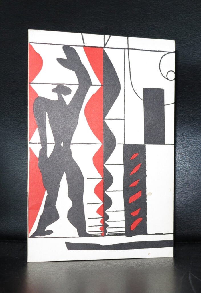
On the curatorial side, Sandberg used his position to build one of the most important modern art collections in Europe, acquiring works by Van Gogh, Cézanne, Picasso, Léger, Mondrian, Henry Moore, Alexander Calder, and Kazimir Malevich, while also expanding the museum’s scope to include design, photography, and graphic art — not just painting and sculpture. He organized around 800 exhibitions over his time there, covering everyone from Le Corbusier (1946) to Jackson Pollock (1958) to the CoBrA group (1949).
One episode stands out. In 1956, Sandberg mounted a show of Picasso’s Guernica alongside sixty related studies, timed to the 350th anniversary of Rembrandt’s birth — he called the painting the “night watch of the 20th century “Getting the painting to Amsterdam took years of persistence “. Sandberg had first seen Guernica in Paris in 1939, then pursued its loan when it traveled to Milan in 1953 and again when it returned to Europe for a Paris exhibition in 1955</cite>, finally securing it for the Stedelijk. It’s a small case study in how Sandberg operated — patient, persistent, and treating a single painting’s arrival as worth years of negotiation because he understood its symbolic weight.
His politics shaped his career in less flattering ways too. Sandberg was openly sympathetic to left-wing ideas, and during the height of the Cold War, from 1949 to 1958, he was repeatedly denied a visa to the United States — a restriction that inevitably affected how much direct contact he could have with the American art world at a moment when American postwar art was becoming impossible to ignore.
The Designer Who Ran the Place
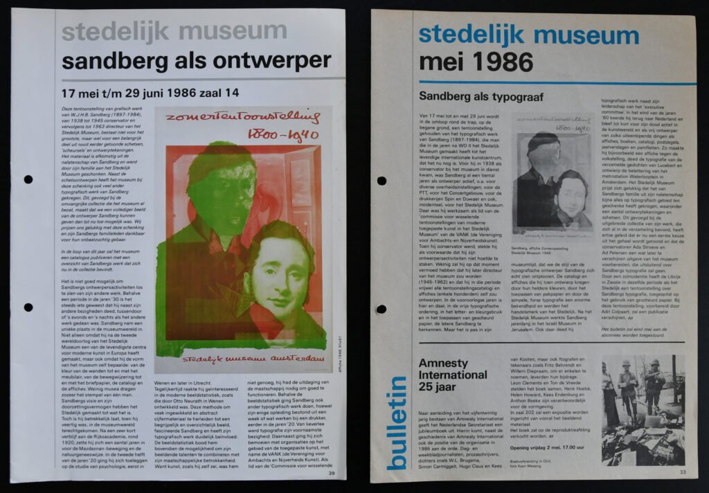
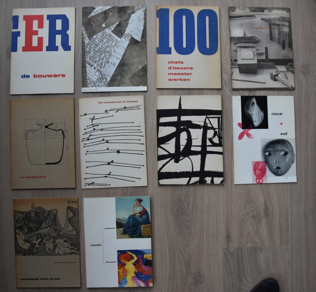
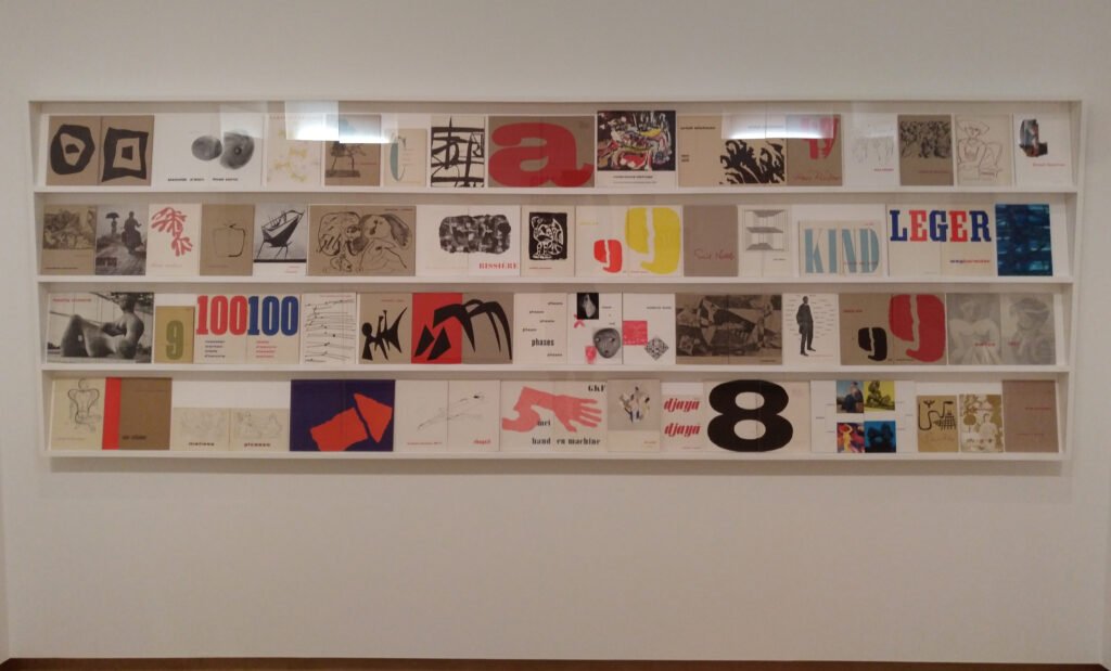
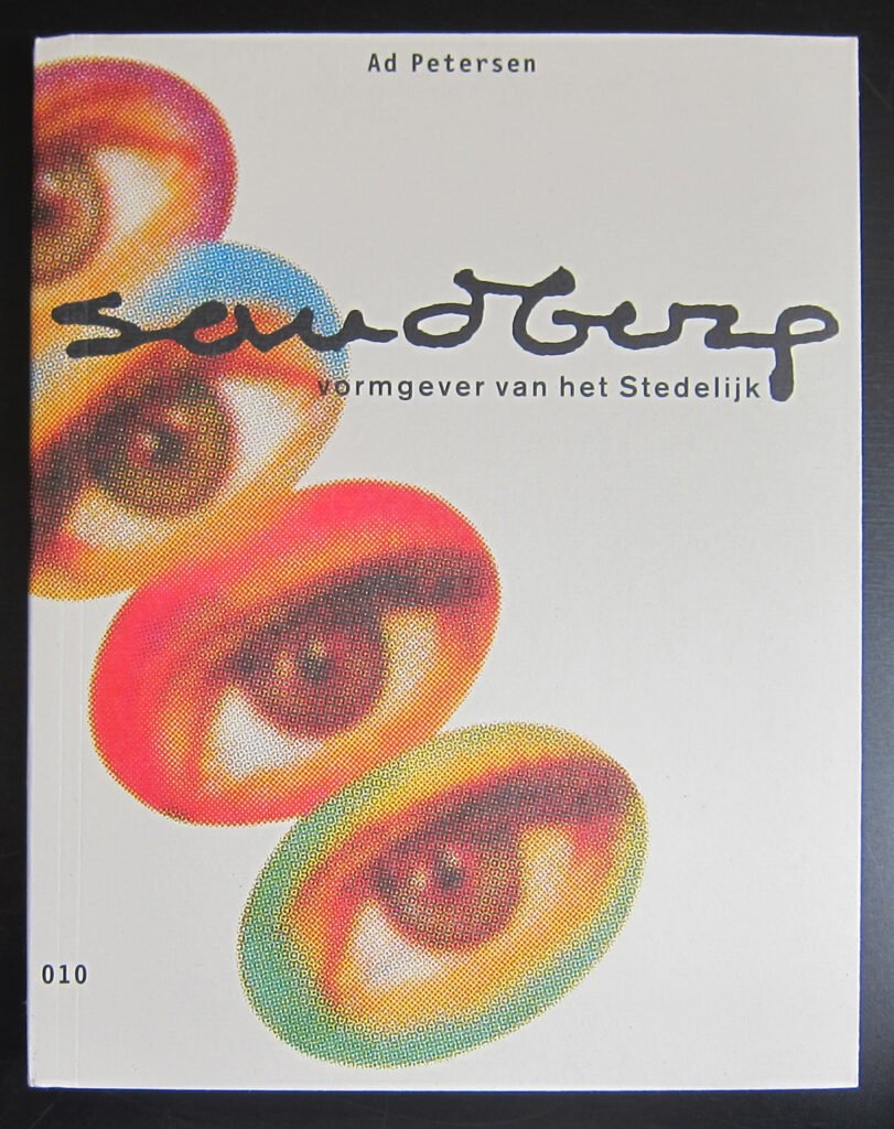
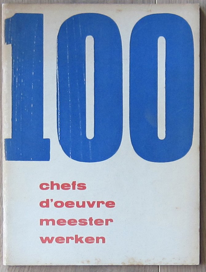
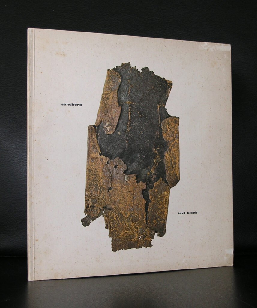
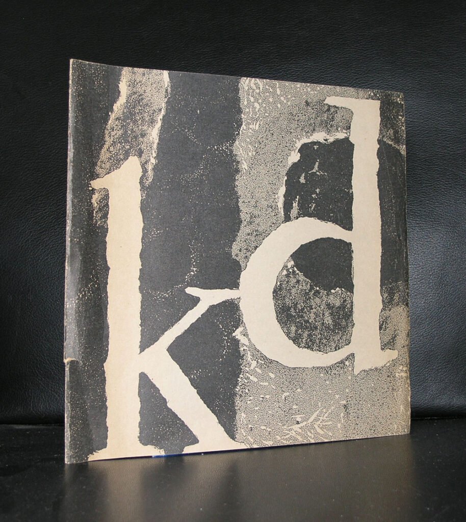
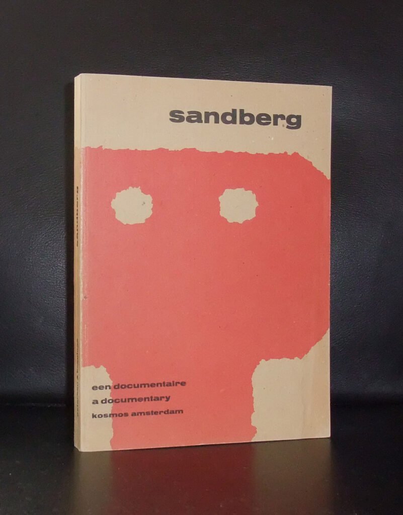
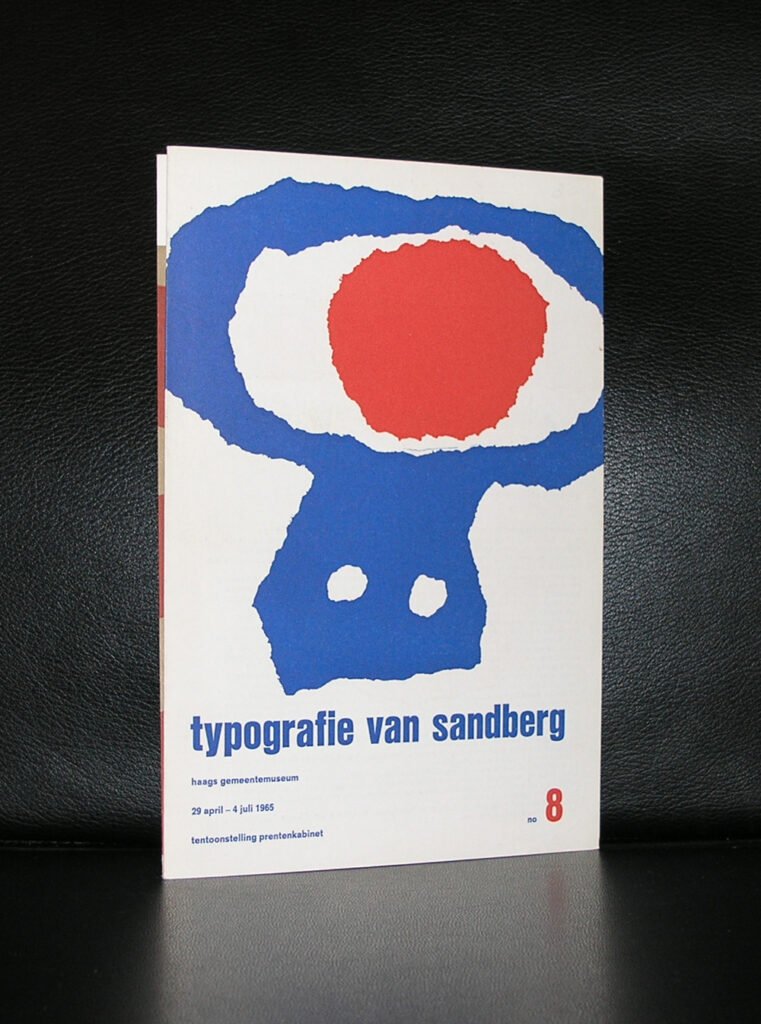
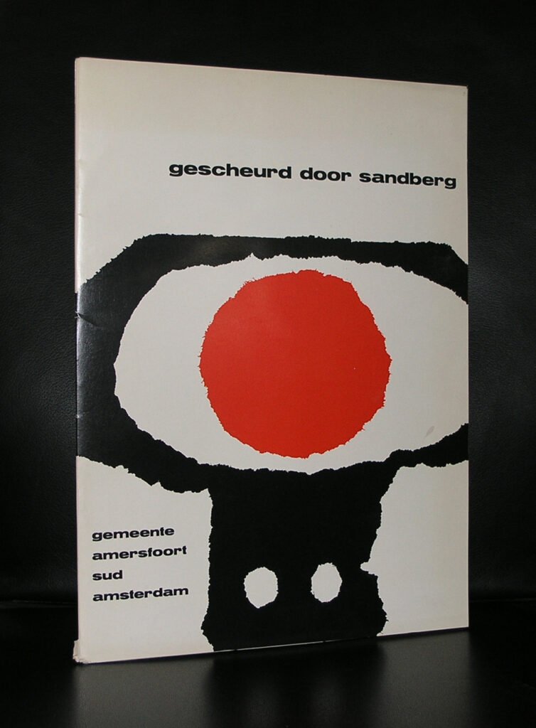
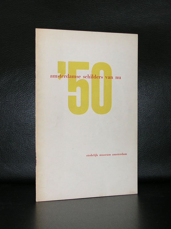
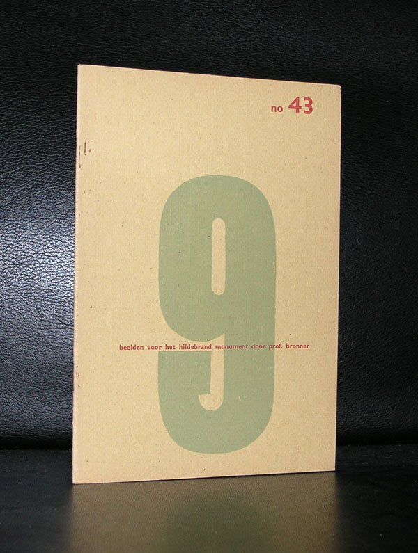
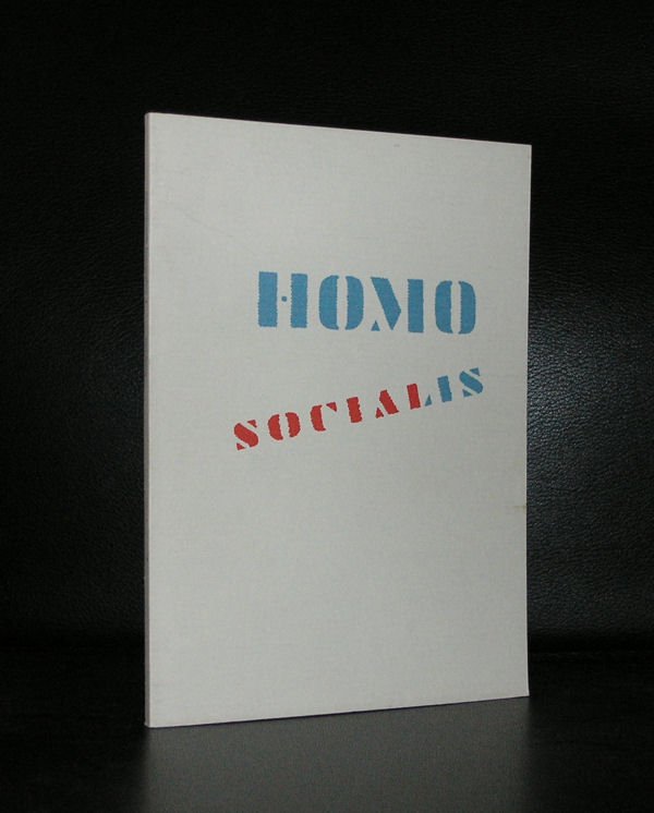
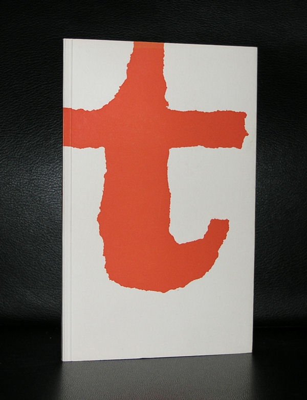
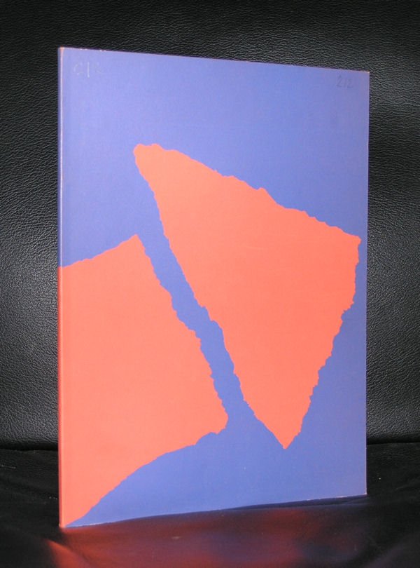
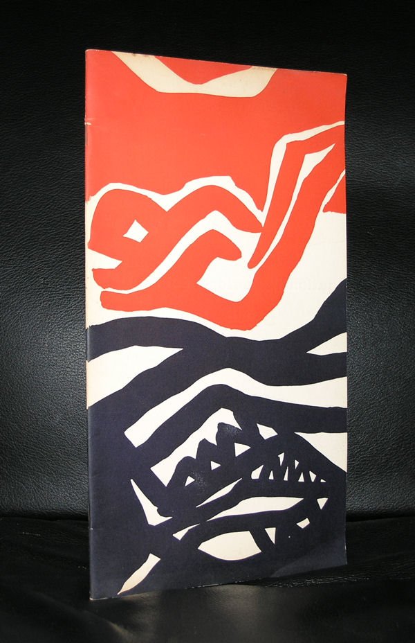
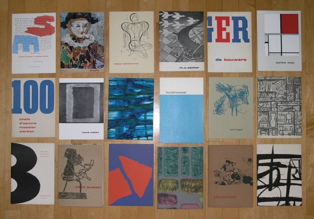
What made Sandberg genuinely unusual, even among ambitious museum directors, is that he never stopped being a hands-on designer. Over his years at the Stedelijk, he is estimated to have produced somewhere around 250 to 380 exhibition catalogues and a similar number of posters — designing the overwhelming majority of them personally, often in the evenings and on weekends, even while running the institution during the day.
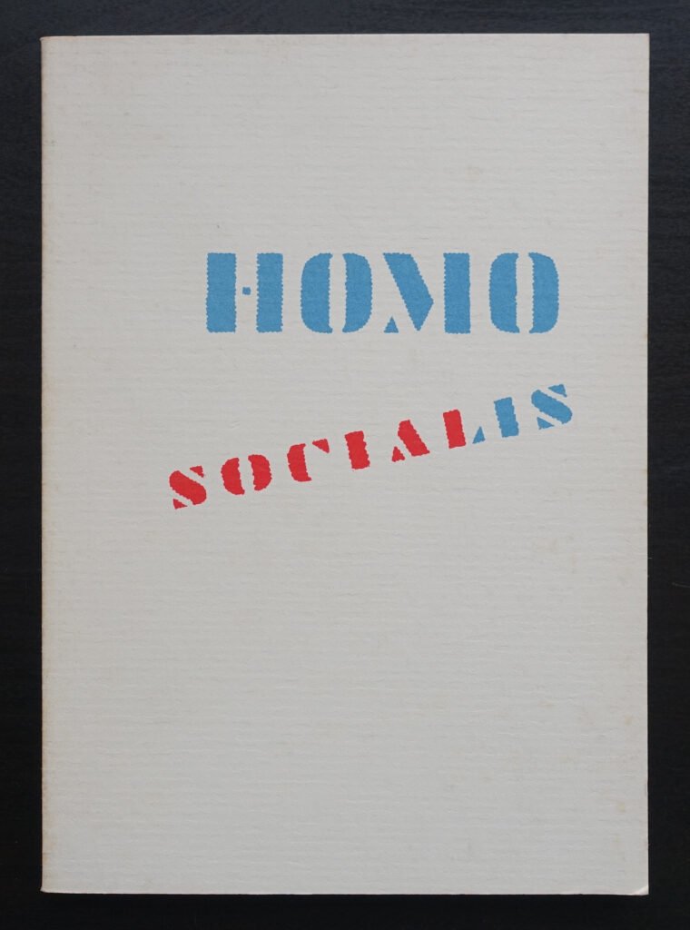
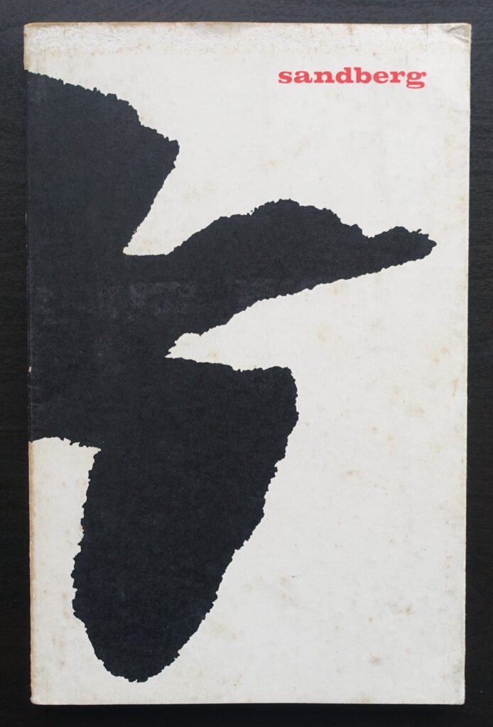
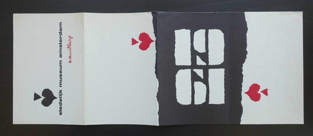
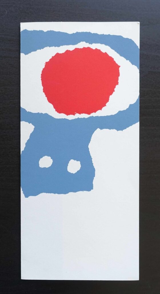
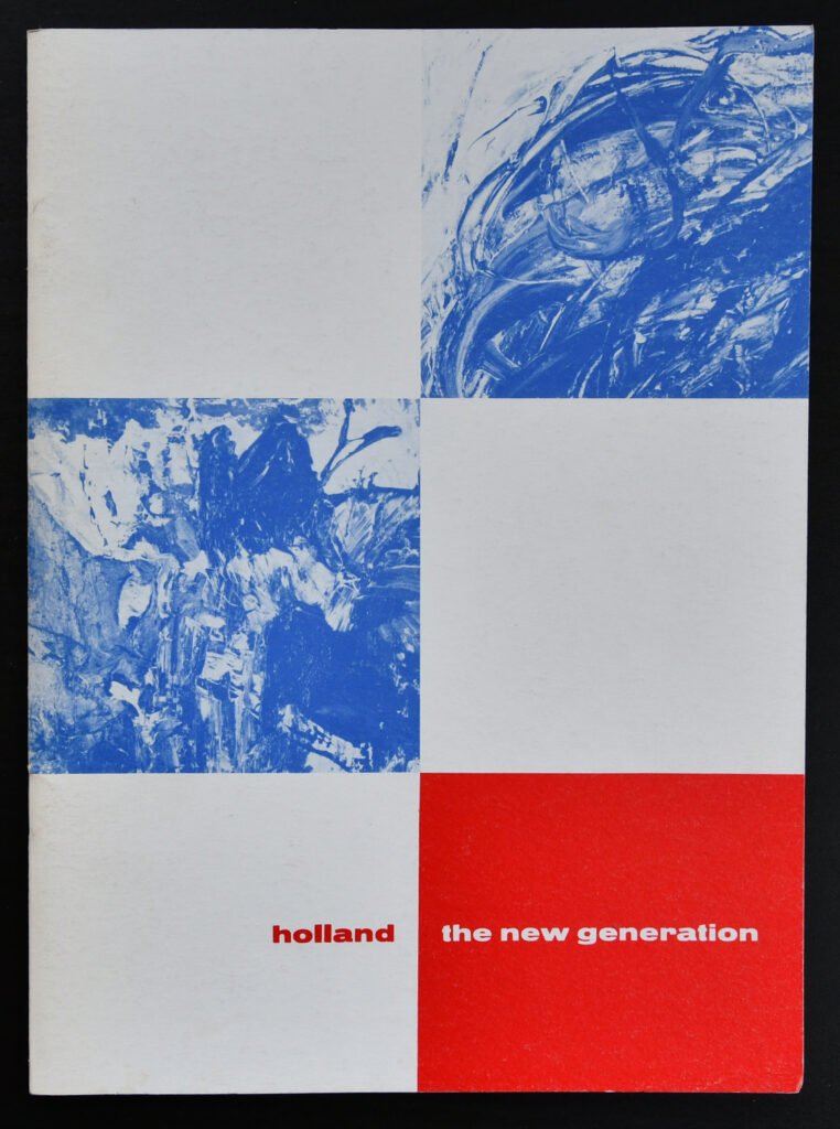
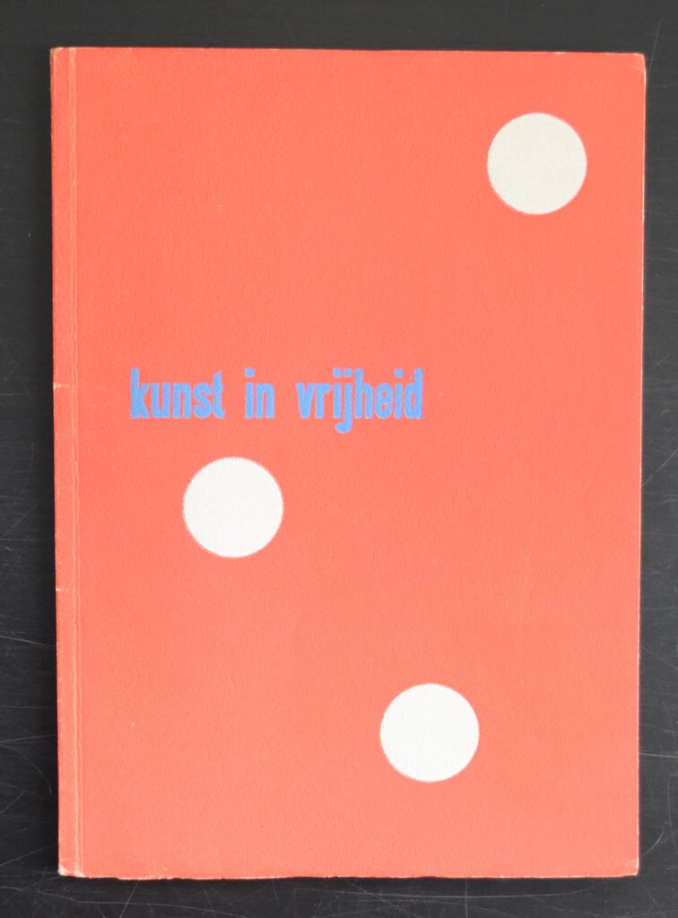
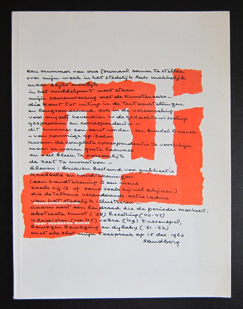
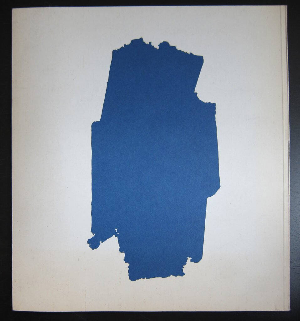
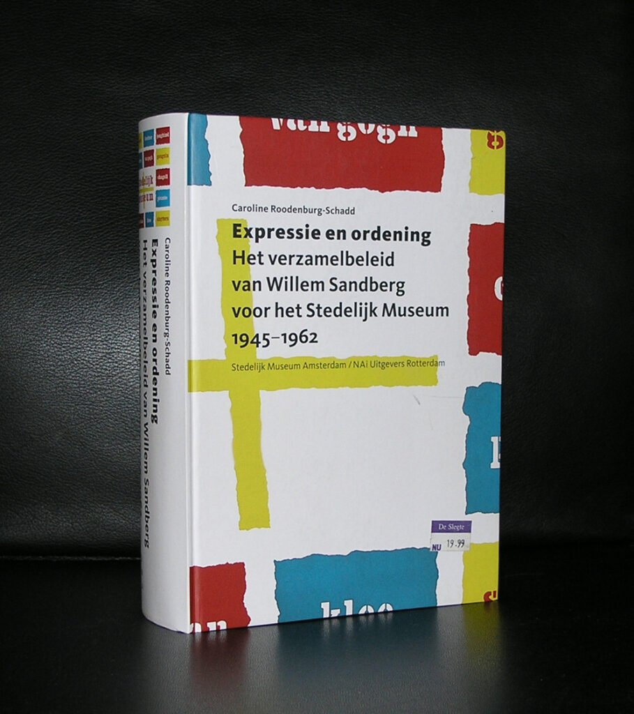
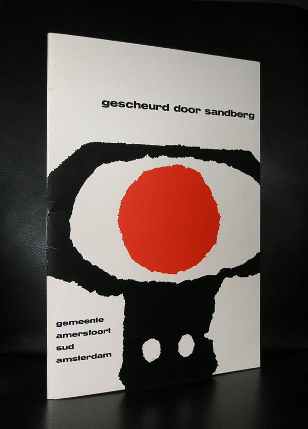
His visual style became instantly recognizable: rough shapes torn from paper rather than cleanly cut, bold primary colors, asymmetrical layouts, and slim catalogues frequently printed on plain brown wrapping paper — partly an aesthetic choice, partly a practical one, since materials were still scarce in the years after the war. He treated the limitations of cheap paper and simple printing not as obstacles but as part of the design language. His major influences were the somewhat older Dutch typographers Hendrik Werkman and Piet Zwart, both of whom had already broken from symmetrical, formal composition — but Sandberg pushed the informality further, turning “cheerful minimum,” as his friend and fellow designer Jan Bons once called it, into a signature.
The design world noticed. Writing in Typographica magazine in 1955, the British typographer and publisher Herbert Spencer described the Stedelijk’s publications as some of the most exciting examples of postwar European design, praising their bold, confident use of color, texture, and modern typographic principles.
After the Stedelijk
Sandberg left the Stedelijk in the early 1960s but didn’t slow down. He spent several years in the mid-1960s helping establish the Israel Museum in Jerusalem, effectively repeating, in a new country, the work of shaping a national institution’s identity from the ground up. He also served on advisory committees for the Pompidou Centre in Paris, including being involved when the museum’s architects — Richard Rogers, Renzo Piano, and Gianfranco Franchini — were selected in 1971.
In 1975, Sandberg shared the Erasmus Prize with the art historian Ernst Gombrich, recognized for what the prize committee described as his exceptionally original and often daring policy of connecting fine art, applied art, architecture, film, and music. He dedicated his share of the prize money to a project aimed at bringing art and science closer together in Jerusalem.
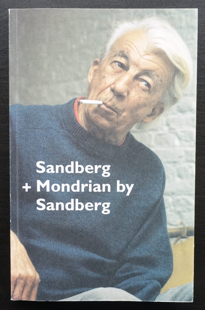
Willem Sandberg died in Amsterdam in 1984, having spent more than half a century inside — and constantly reshaping — the same institution he’d started working for as a twenty-something with no formal design training.
Why He Still Matters
It’s easy, looking back, to separate “museum director” from “graphic designer” from “resistance fighter” as though they were three different résumés. Sandberg didn’t experience them that way. The same instinct that led him to forge identity papers under a false name — using craft skill in service of something urgent and human — is visible in the torn-paper posters he made twenty years later to sell tickets to a Cobra exhibition. He treated typography as a practical tool for solving a problem in front of him, whether that problem was saving someone’s life or making a Picasso retrospective feel approachable to an ordinary visitor.
That’s arguably his most lasting legacy: the idea, now taken for granted at museums worldwide, that an institution’s design — its posters, its catalogues, its door handles, even its typeface — isn’t decoration bolted on after the real work is done. It is the work. Sandberg never separated the two, and the museum world has never quite gone back to thinking of them as separate since.
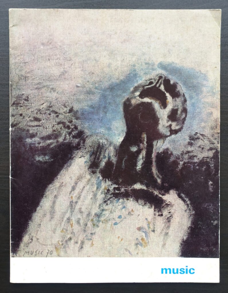
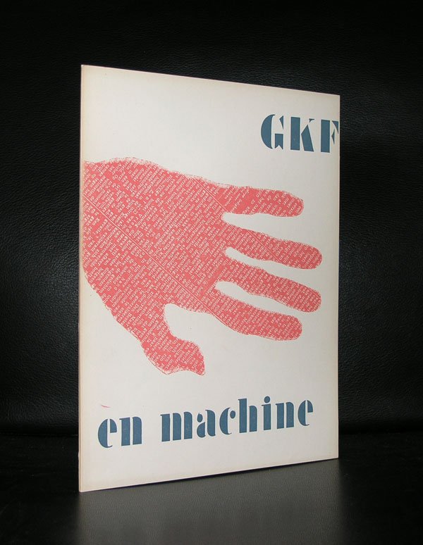
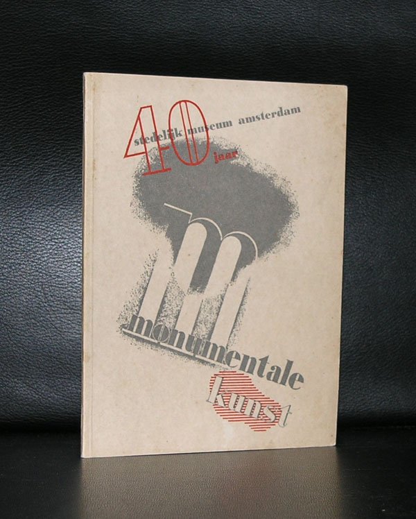
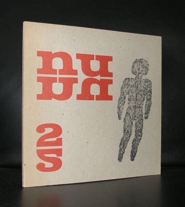
Below is a selection of the over 600 Sandberg related items , www.ftn-books.com has in ts inventory.