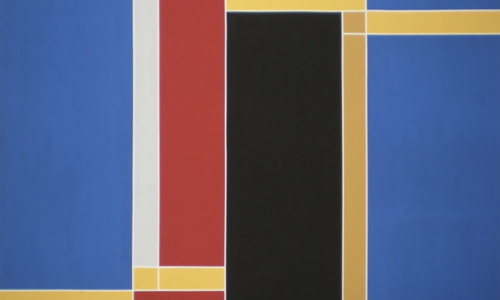
Müller-Brockmann is widely regarded as one of the most revered graphic designers in the history of our profession. His creations are studied, taught and published to this day, serving as the pinnacle of Swiss graphic design (also known as the international style). Strongly influenced by the Bauhaus and constructivism movements, typography and geometry dominate his work. Anchored by a rigid grid system that has become his signature style, his compositions exude an economically and rationally precise aesthetic.
Despite his lasting influence in the field, Müller-Brockmann remains somewhat enigmatic. The only complete monograph about him was published by Lars Müller shortly before his passing. The book features an introduction by none other than Paul Rand himself (a testament to his impact!). In it, Lars Müller attempts to uncover what spurred Brockmann’s transition from illustration to a more constructivist approach in his graphic designs.
At the time, Brockmann was greatly inspired by Hungarian photographer Moholy-Nagy’s work and Jan Tschichold’s manifesto, “Die neue Typographie.” This modernist manifesto advocated for the use of bar typefaces (referred to as grotesk in German). These principles greatly influenced Brockmann throughout his career.
These guidelines can be summed up as strict adherence to composition grids, objective imagery to minimize emotional influence, and emphasis on rhythm, harmony, and geometric compositions backed by mathematical precision. One notable example is Brockmann’s approach to concert posters, viewing music as an abstract art and infusing that into his designs. In fact, Lars Müller describes his Beethoven poster from 1955 as the ultimate expression of “musicality in design.”
The principles outlined above can be encapsulated as the utilization of stringent composition grids, objective photographs to convey information devoid of emotions, and the incorporation of rhythm, harmony, and mathematical and geometric arrangements. As an illustration, at the time, Brockmann perceived music as an abstract art form, hence he approached his concert posters through an abstract lens. Critically acclaimed publisher Lars Müller hailed Brockmann’s Beethoven poster (1955) as the epitome of “musicality in design”.
Brockmann articulates his stylistic approach with utmost lucidity: “In my work encompassing posters, advertisements, brochures, and exhibitions, subjectivity is eliminated in favor of a geometric grid that dictates the positioning of words and images. The grid serves as an organizational system that enhances the readability of the message, resulting in a more impactful outcome at a minimal cost. A random organization may seem like an easier, quicker, and more efficient solution, but it fails to achieve the same level of uniformity across international borders (thus, the birth of the international style!), which proves to be advantageous in advertising, as demonstrated by IBM’s success. By communicating information as objectively as possible, the message is conveyed without unnecessary superlatives or emotional subjectivity.”
www.ftn-books.com has the Zurich invitation for his exhibition now available.


This helped clarify a lot of questions I had.
This post gave me a new perspective I hadn’t considered.
Your tips are practical and easy to apply. Thanks a lot!
Yo, B52dangnhap is my go-to when I need a quick and reliable login. No messing around, straight to the action! Check it out b52dangnhap.