Stylized paintings are a trademark of Julian Opie. In the Netherlands one would compare him with Joost Swarte who uses a thick outline for his drawings. With this he emphasizes his compositions and makes it look stylized, but still realistic.
He is a very influential figure on the British art scene in the 1980’s who created humourous art. His sculptures have been said to be a cross between architecture and art. His portraits had a pop art feel to them and his most famous piece is probably the cover of a Blur album. Julian Opie’s work is extremely distinctive and although many people have created pieces of work inspired by him, you can always tell that his work has been made by him from the block colors and simple facial features and the thick black lines. His minimalist portraits are so unique because of the simplicity of them.
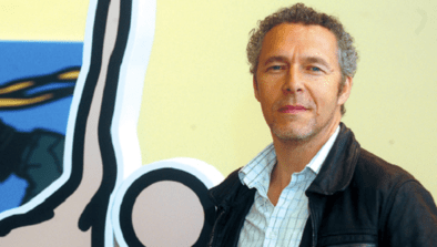
On the left there is an example of Opie on the right there is an example of Swarte.If i must describe the portraits by Opie…these are simplified portraits of the essence of a face The same technique as Joost Swarte uses but less realistic and more suitable for the use in comics and illustrations.


http://www.ftn-books.com has some Julian Opie titles available


